Filters

1 tattoo artist · 1 tattoo studio
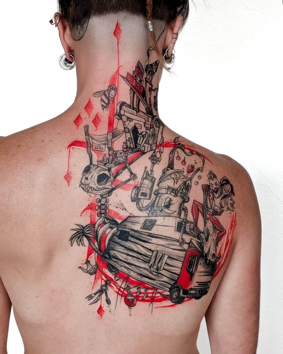
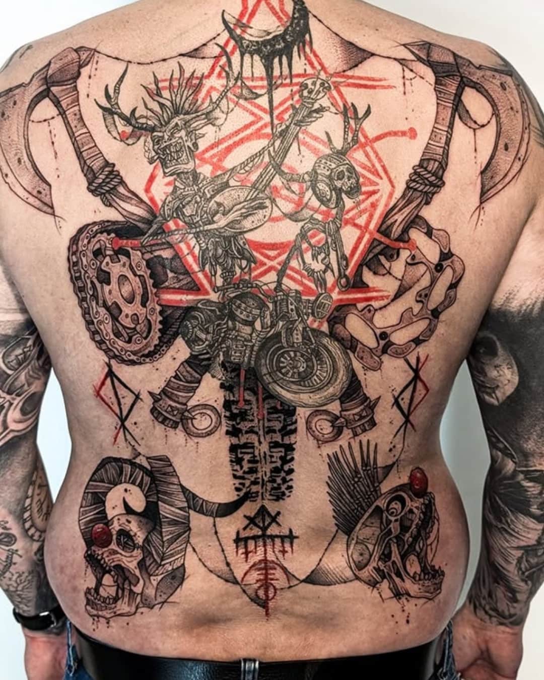
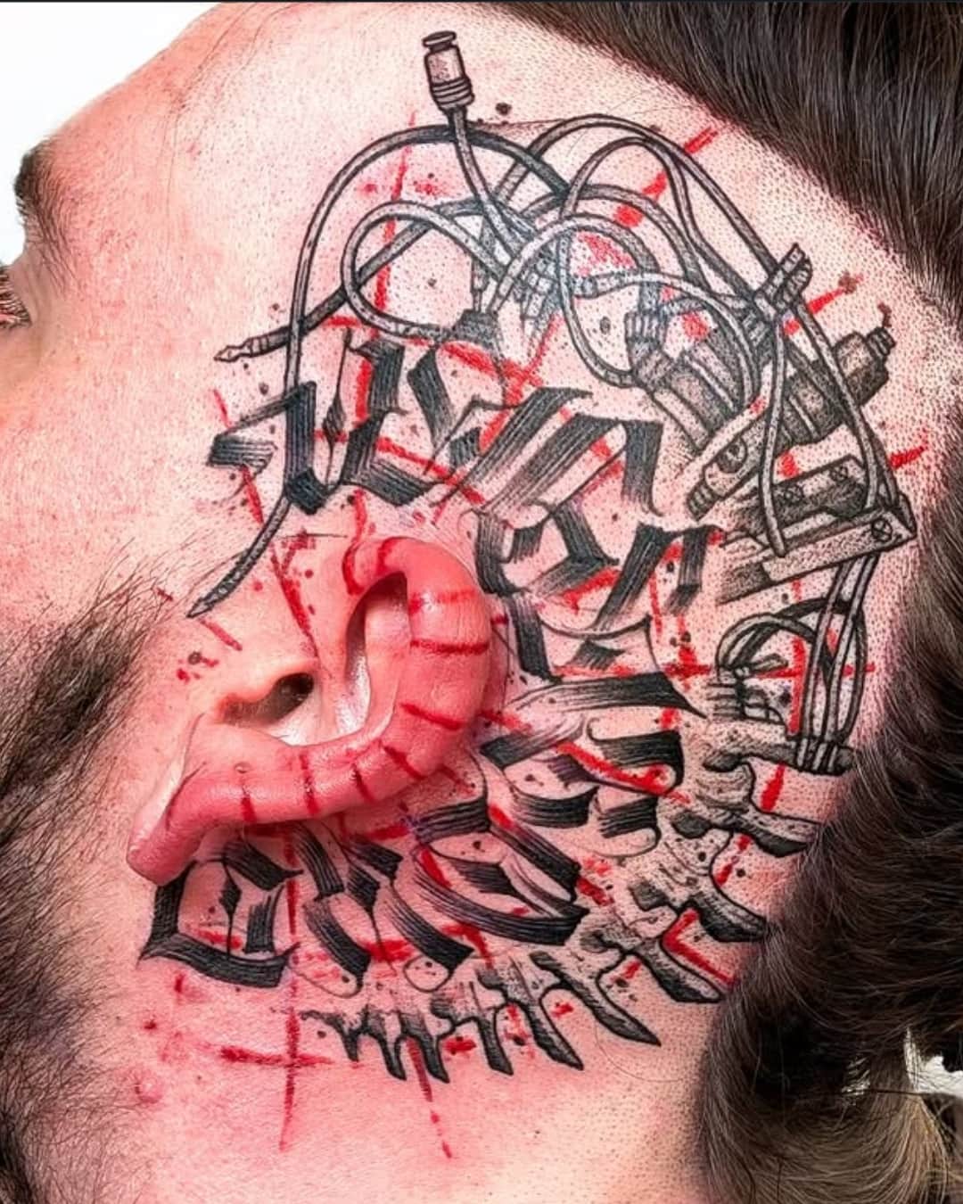
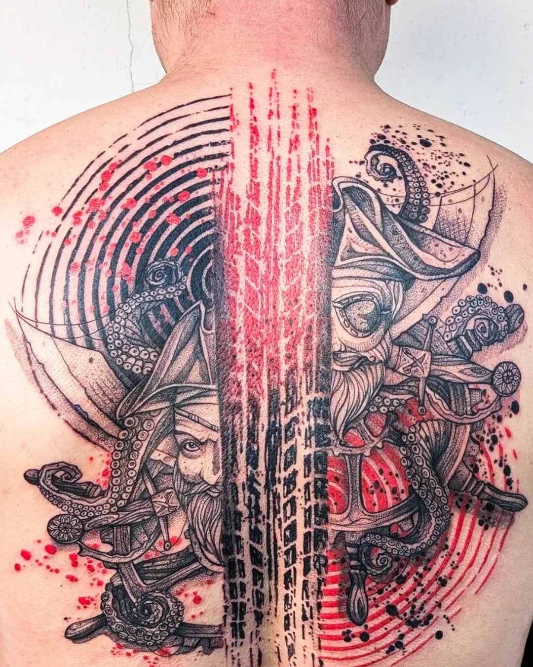
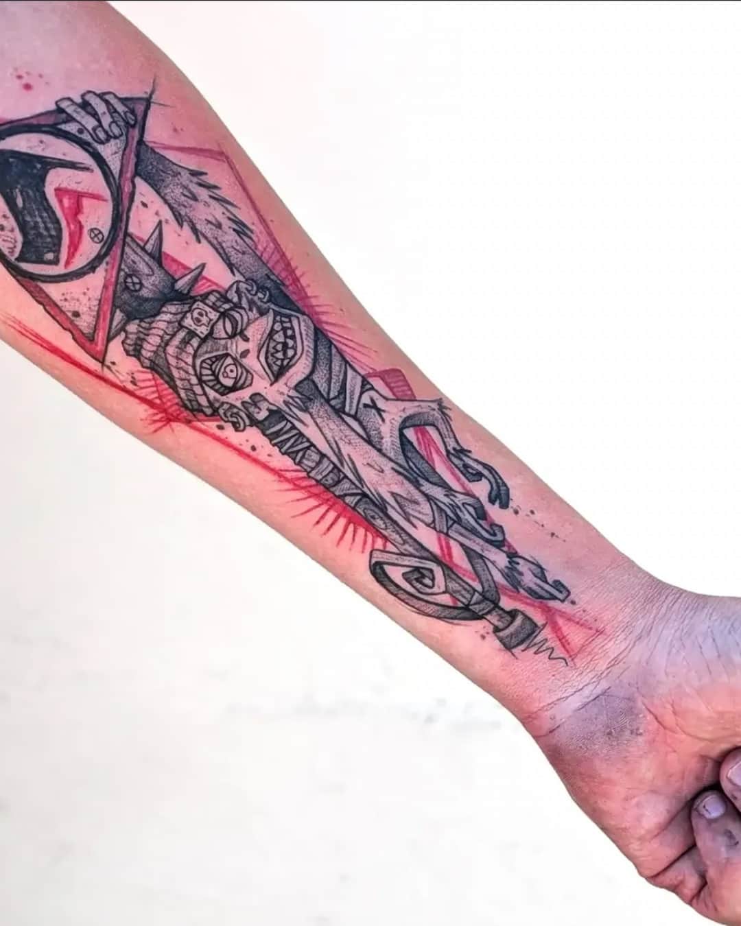
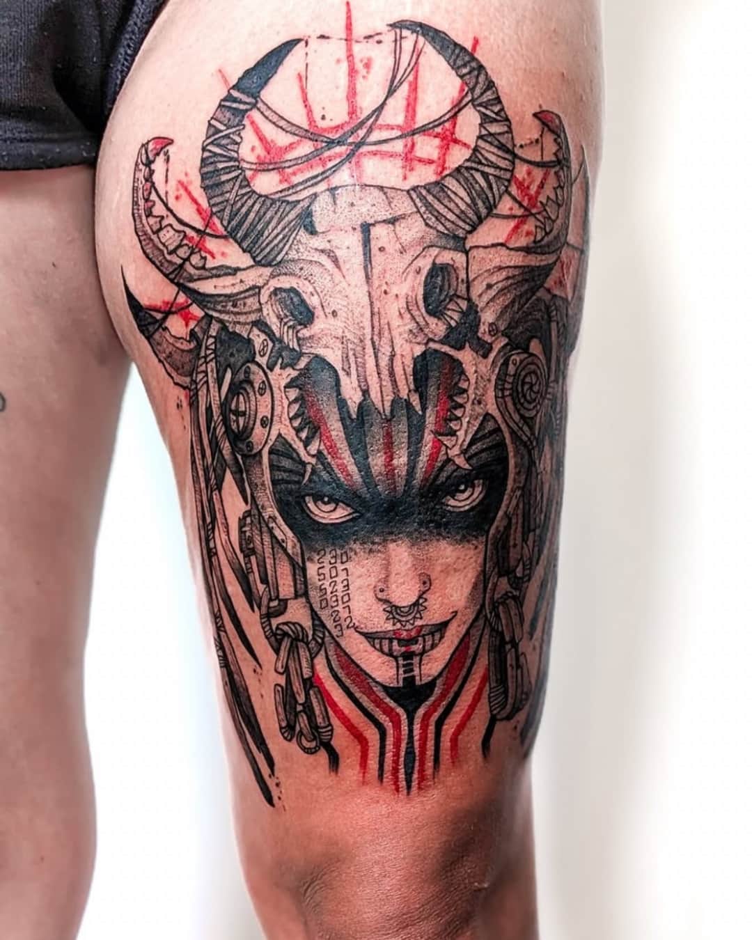
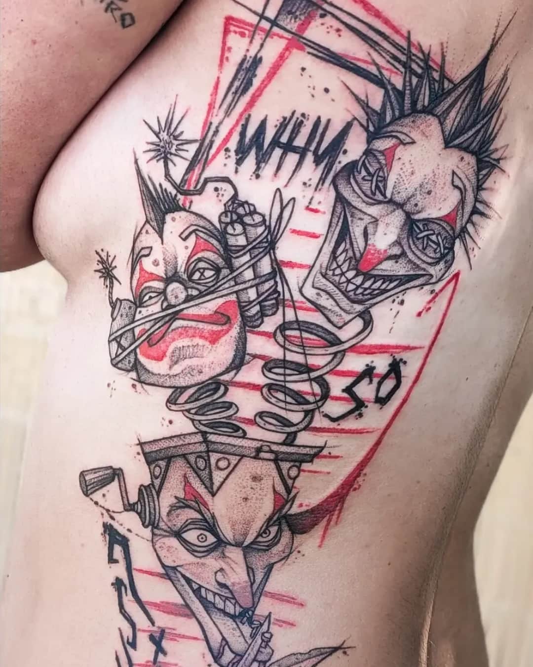
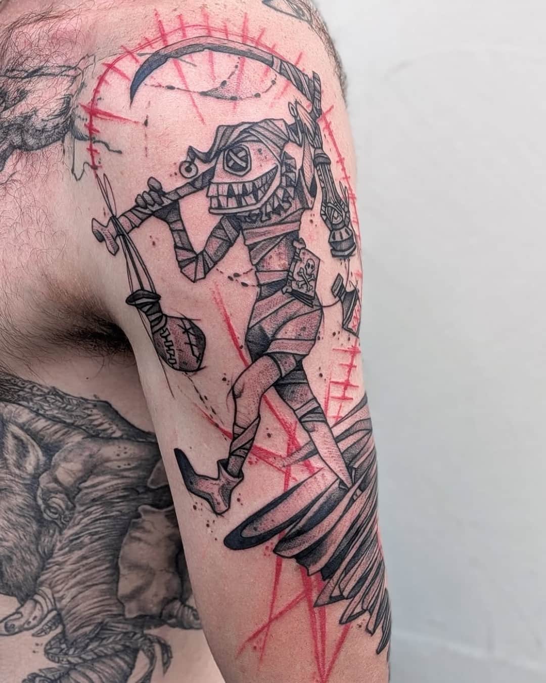
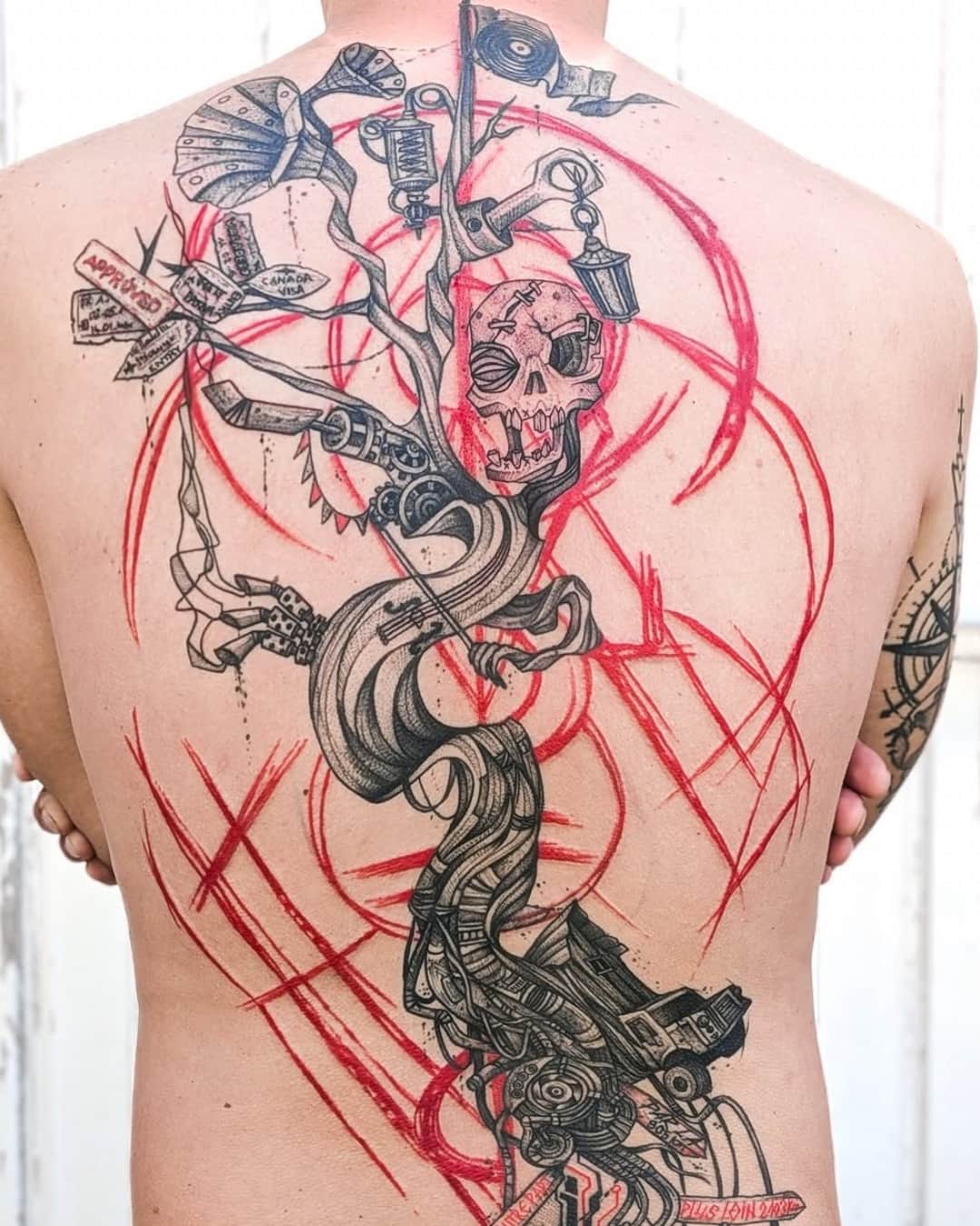
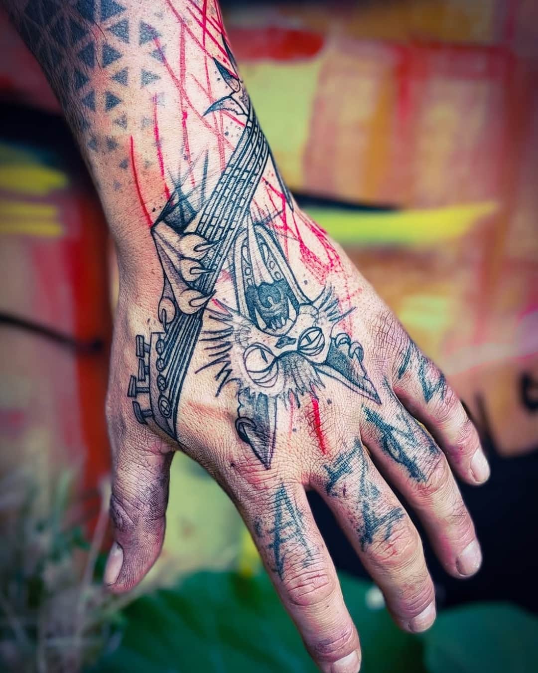
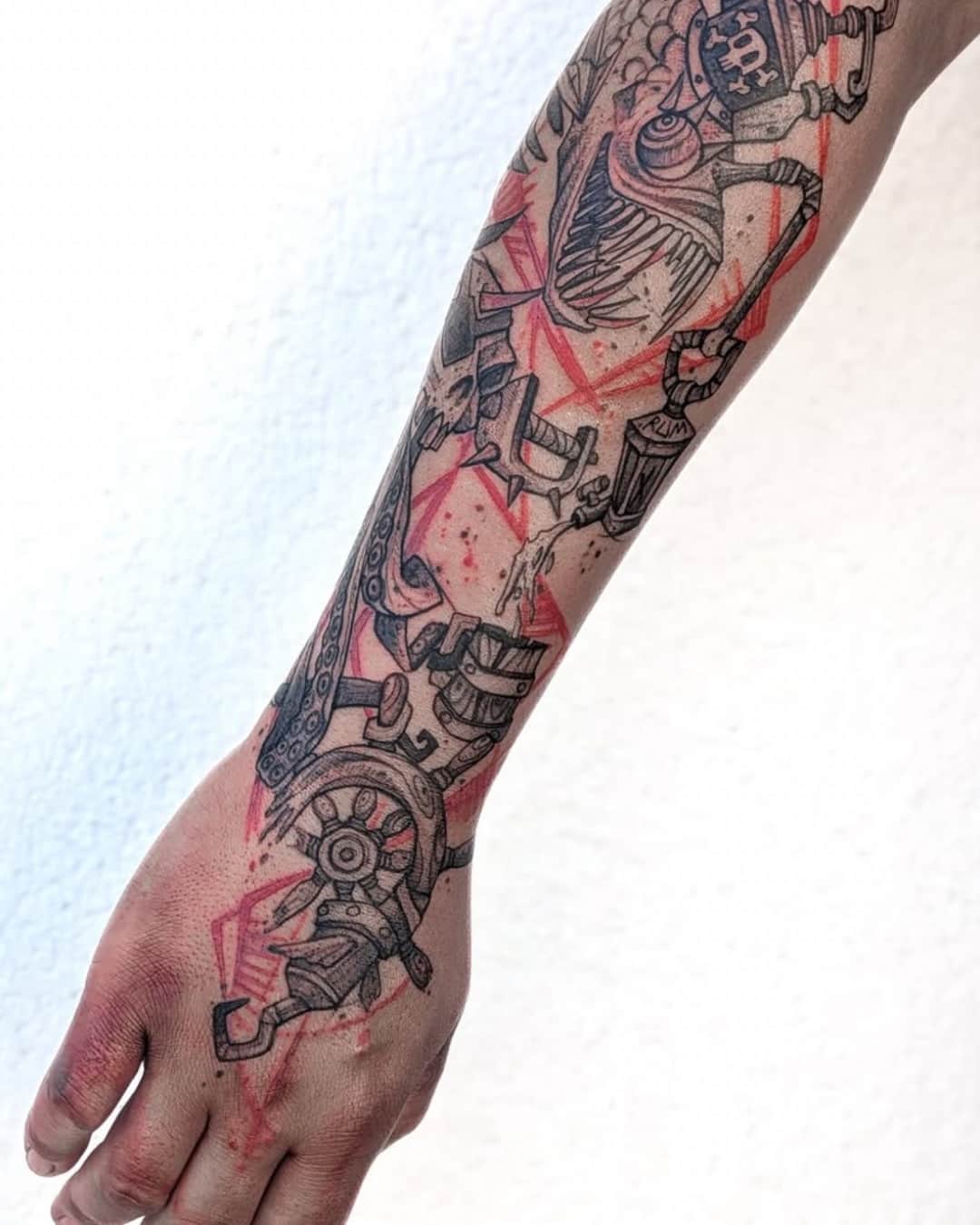
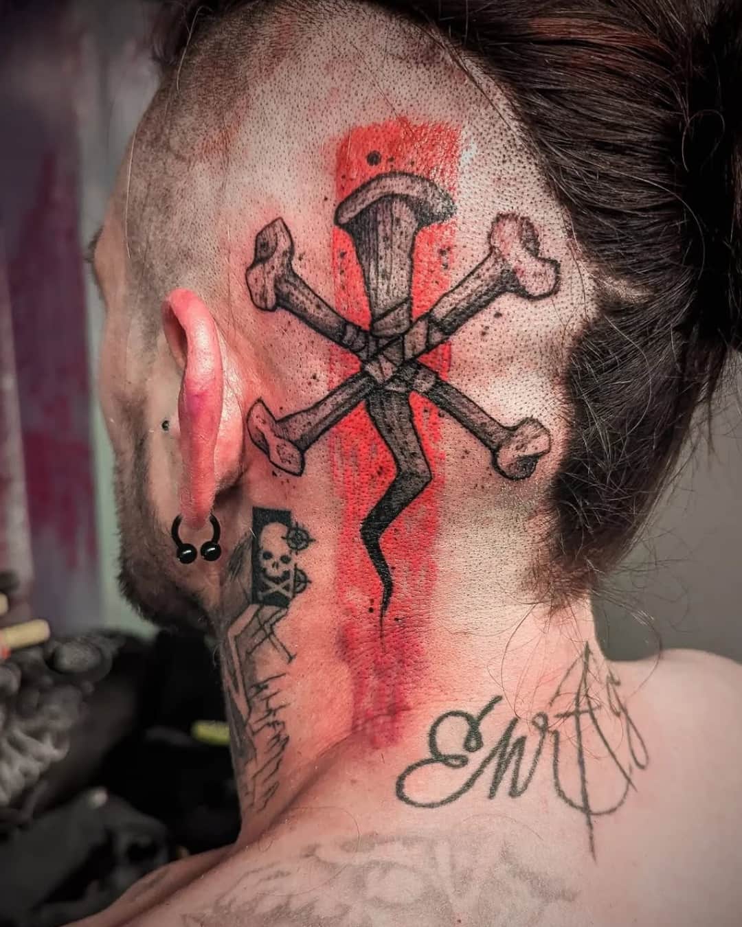
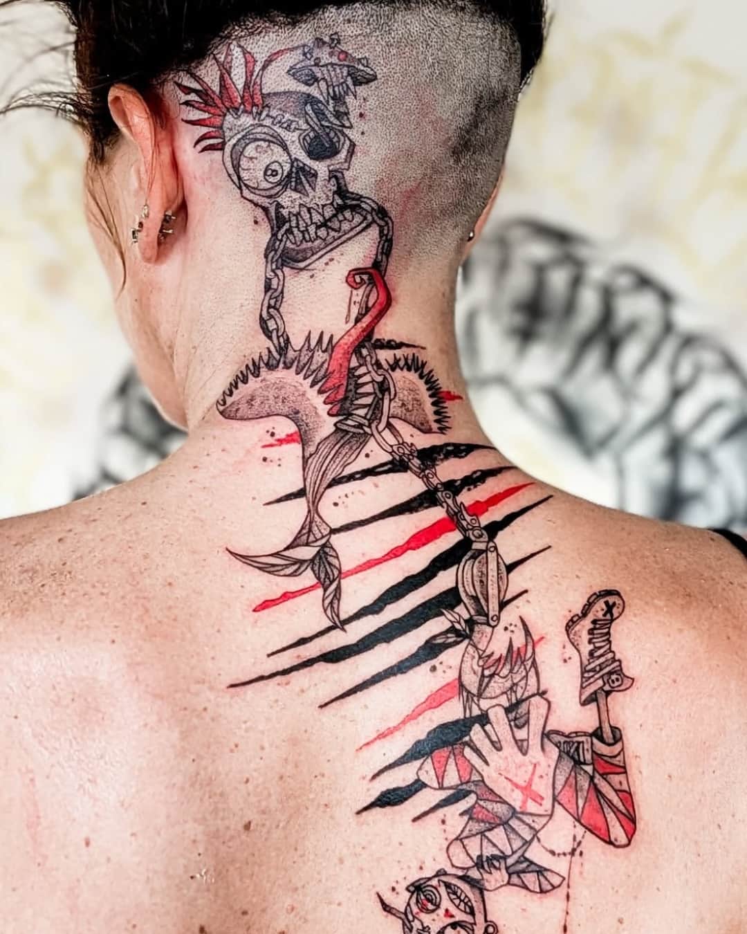
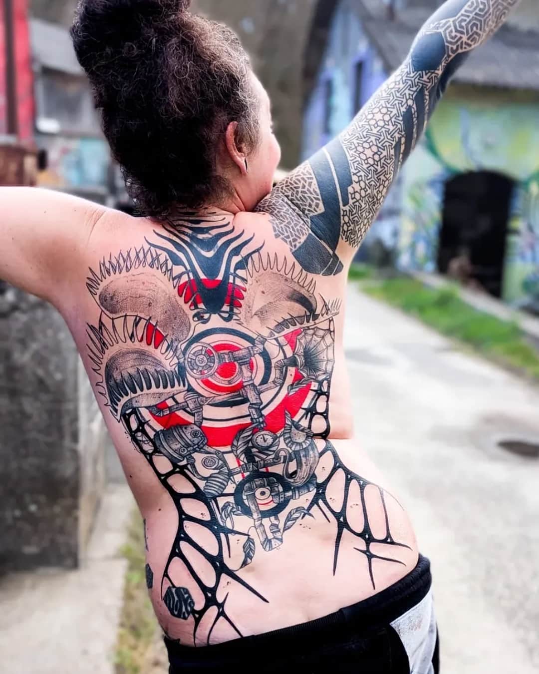
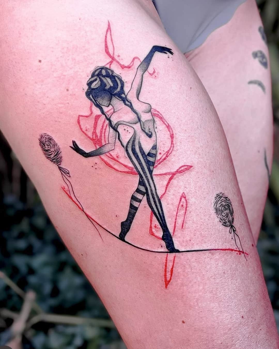
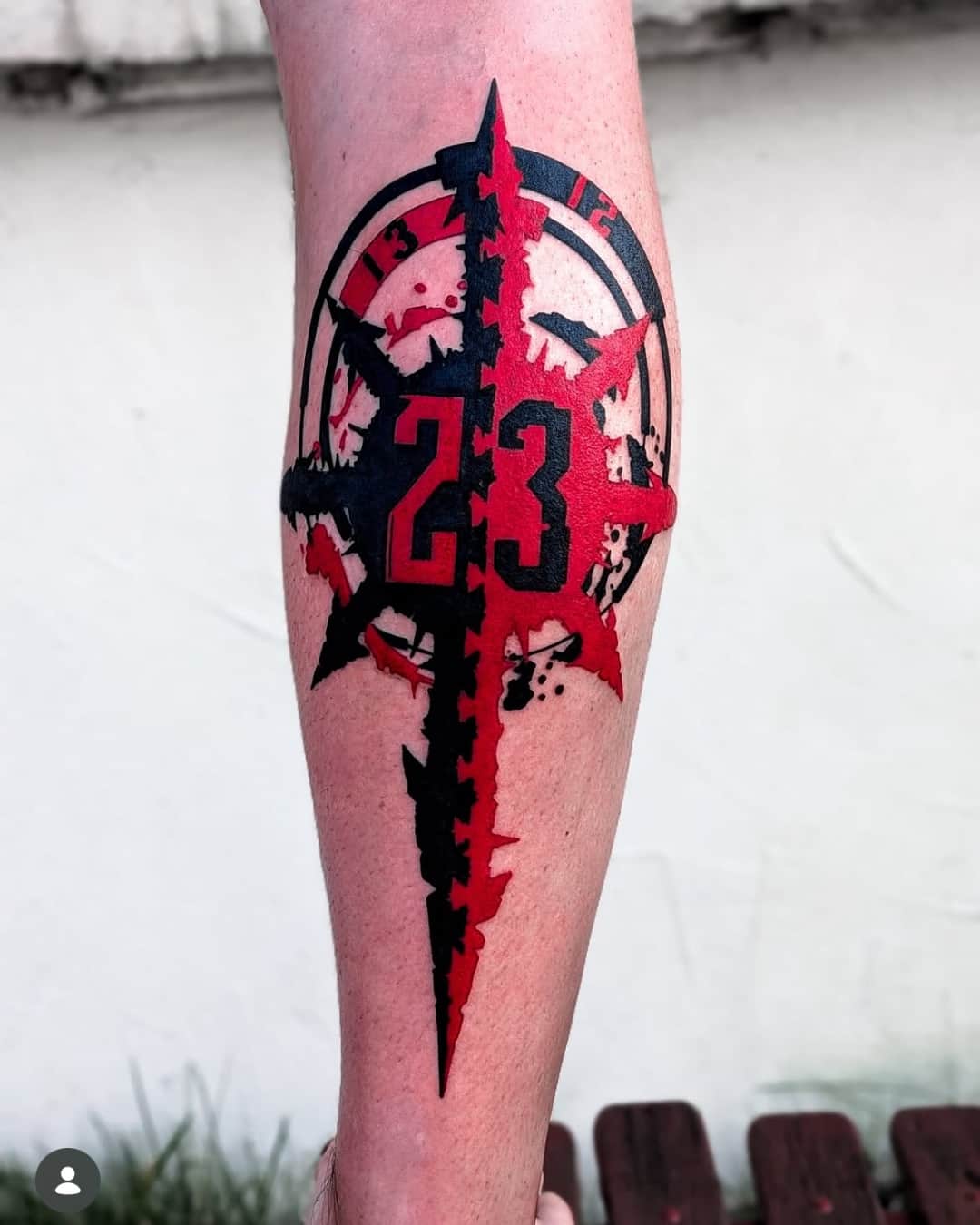
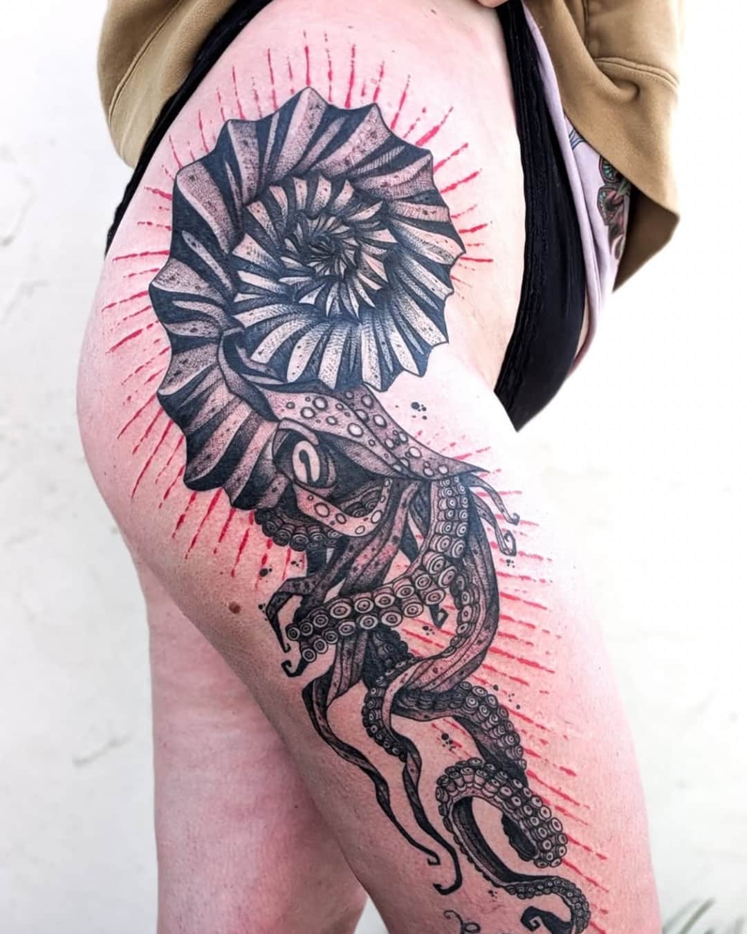
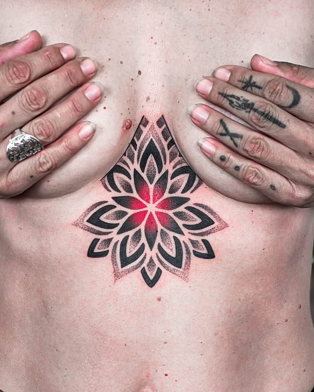
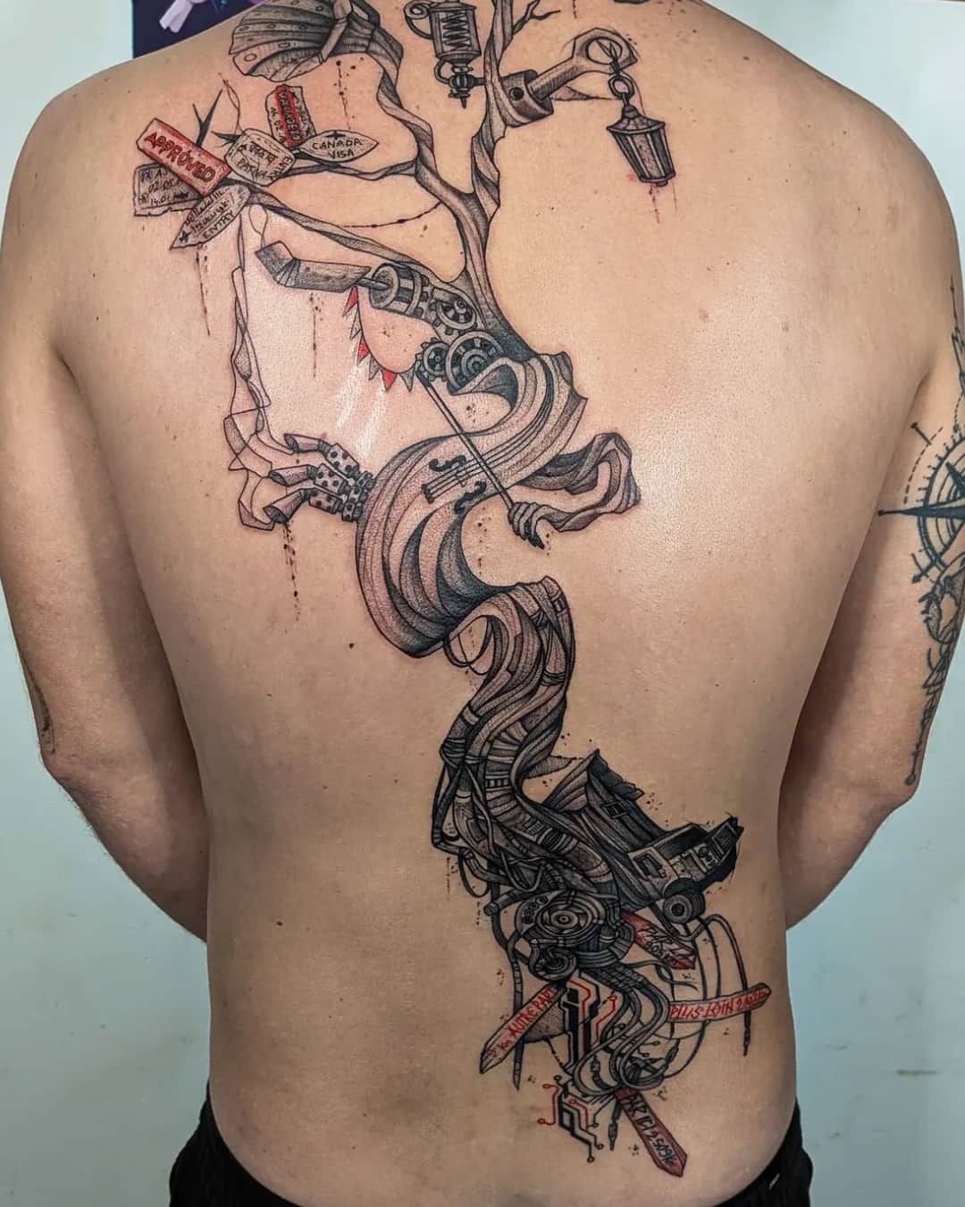
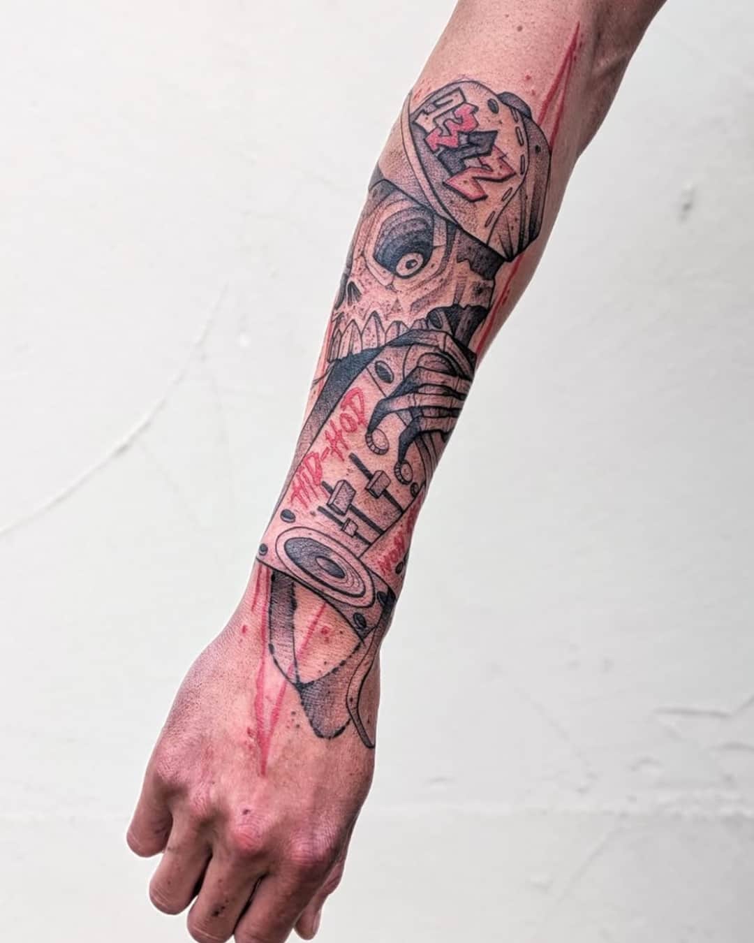
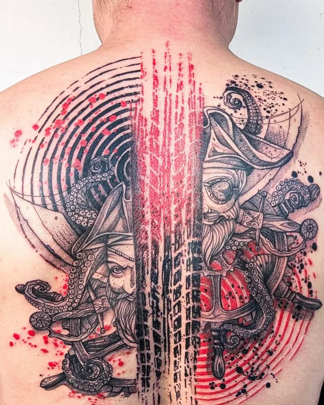
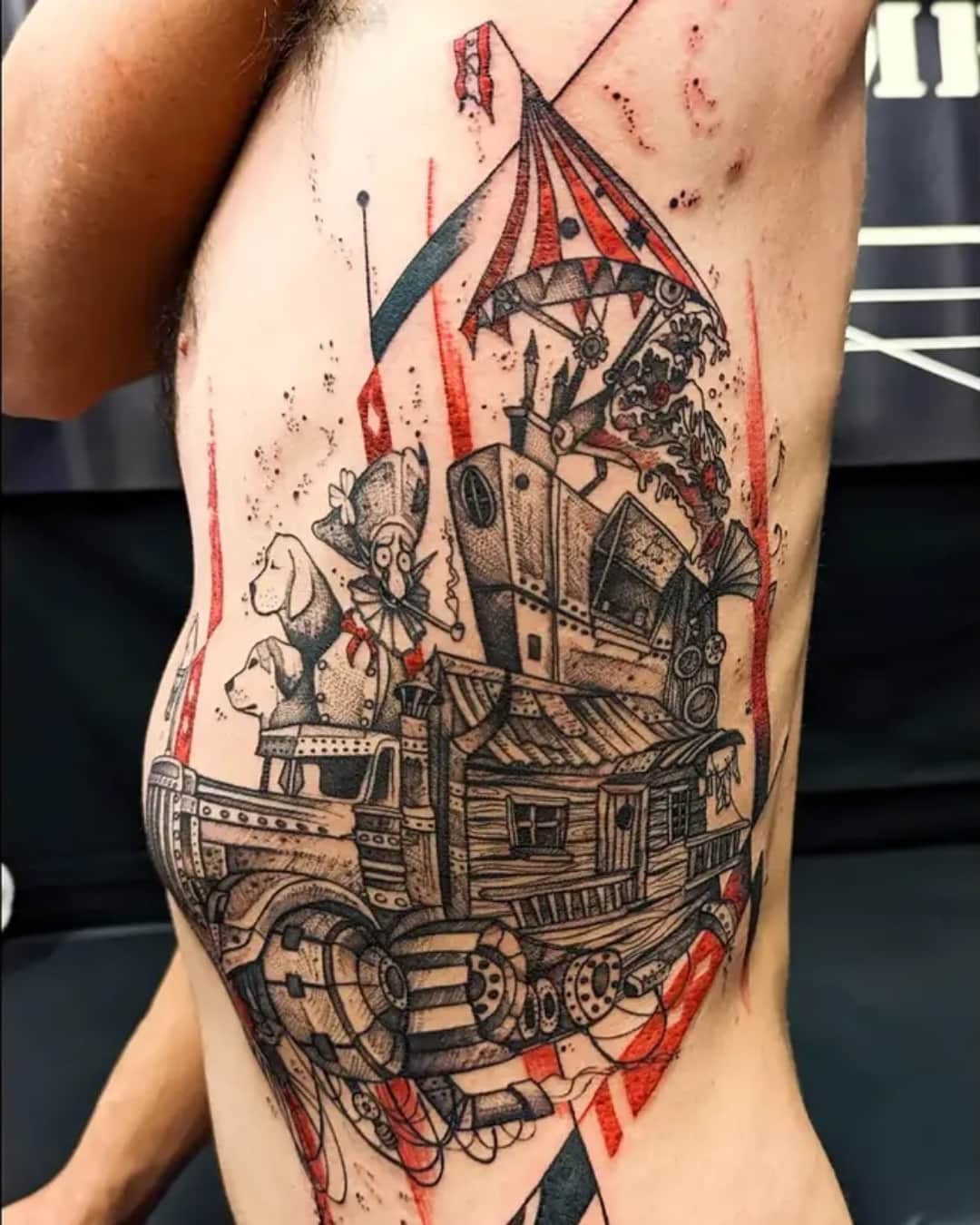
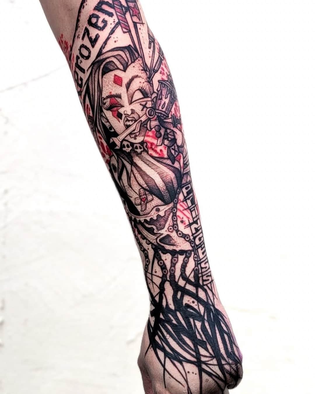
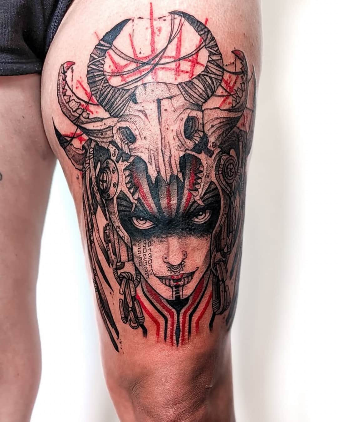
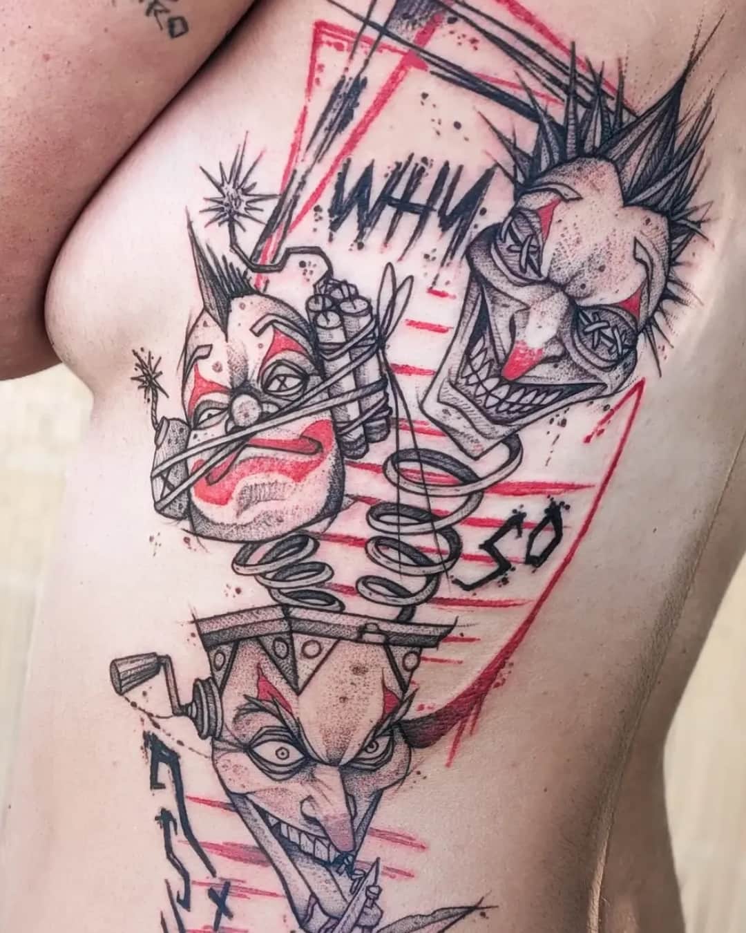
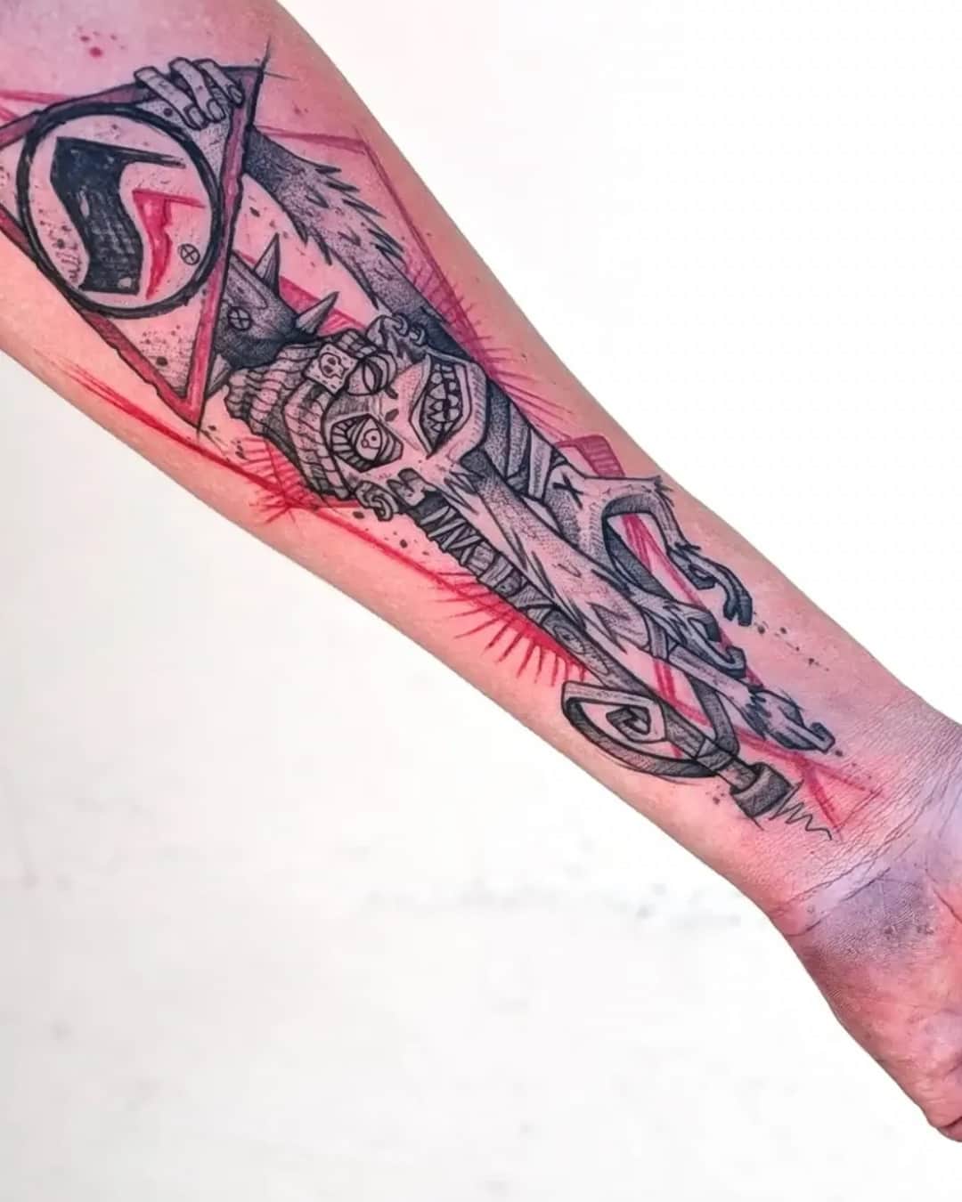
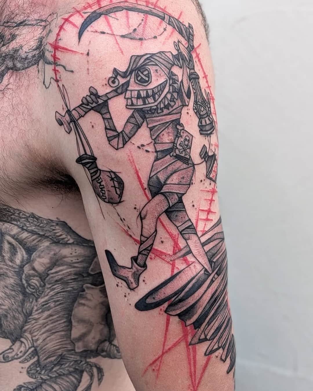
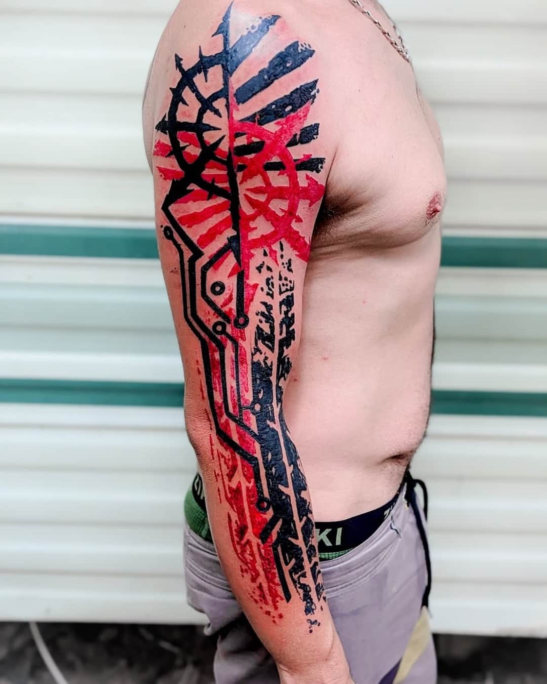
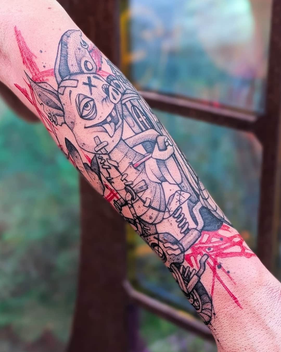
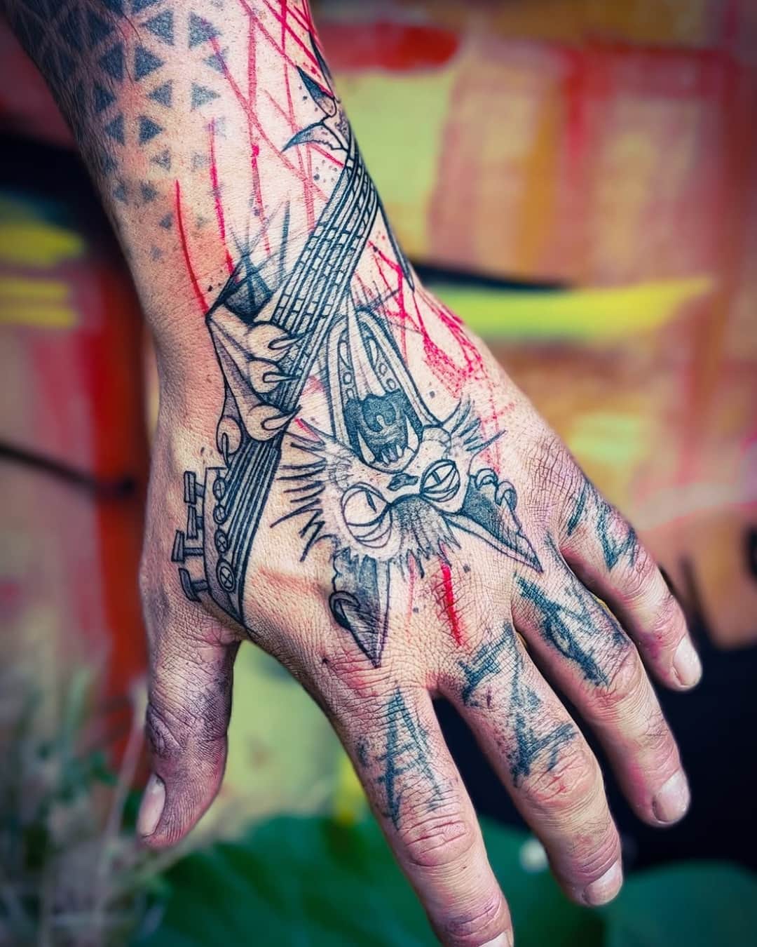
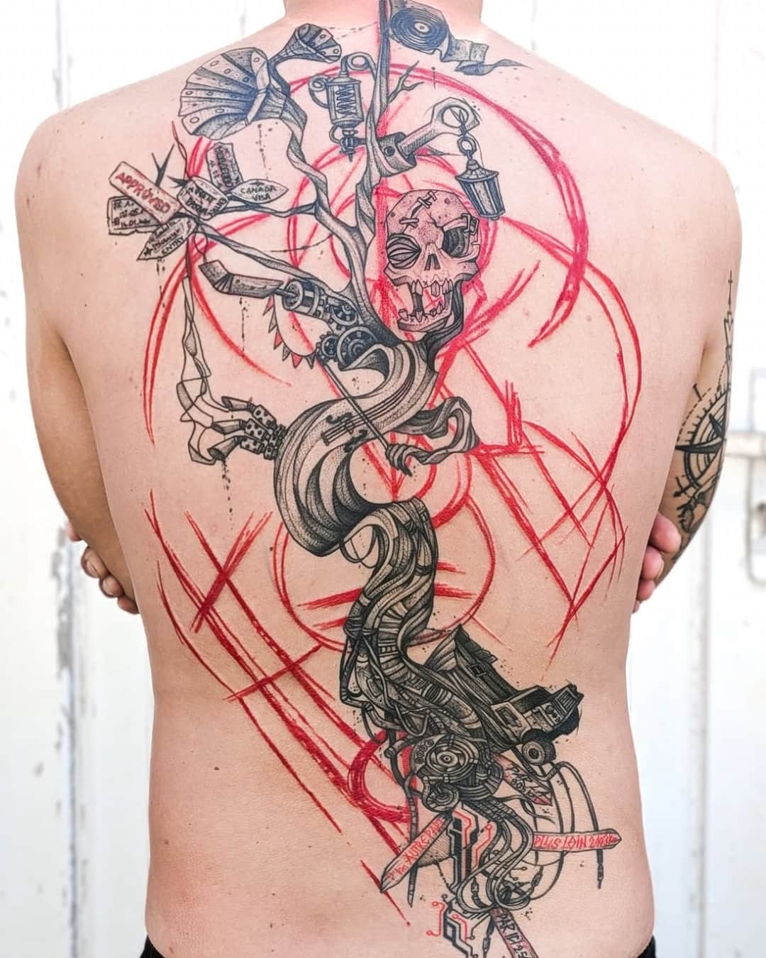
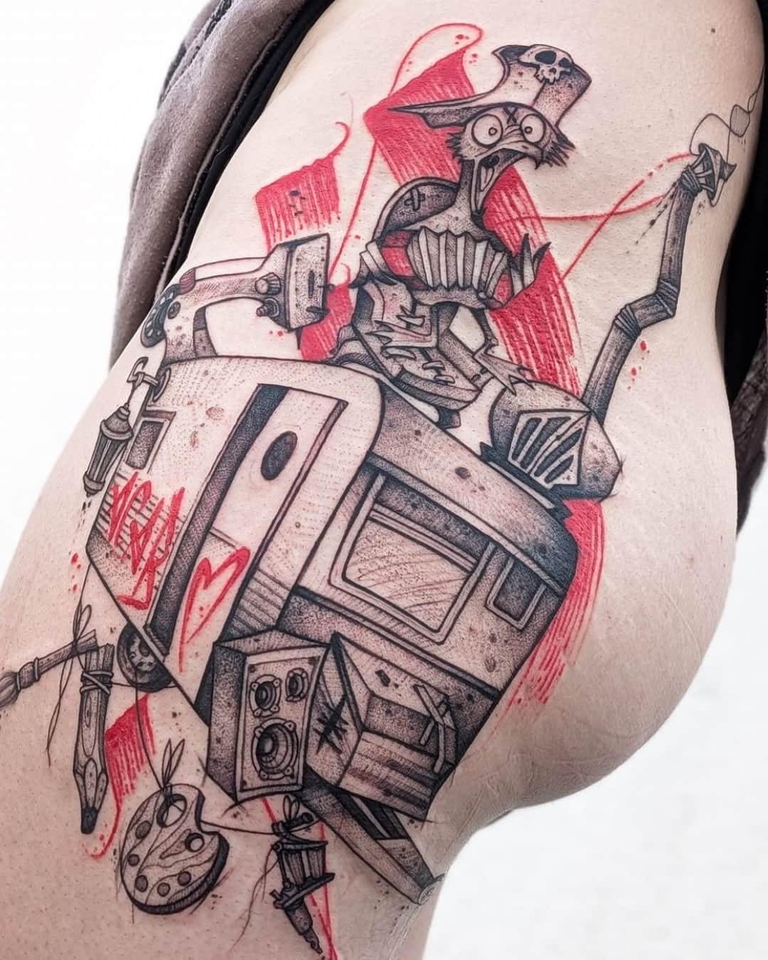
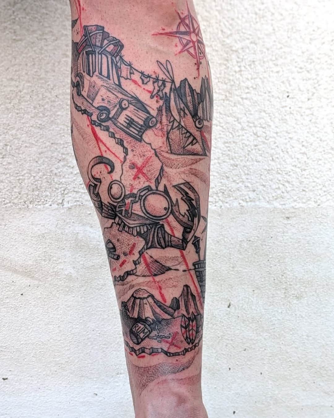
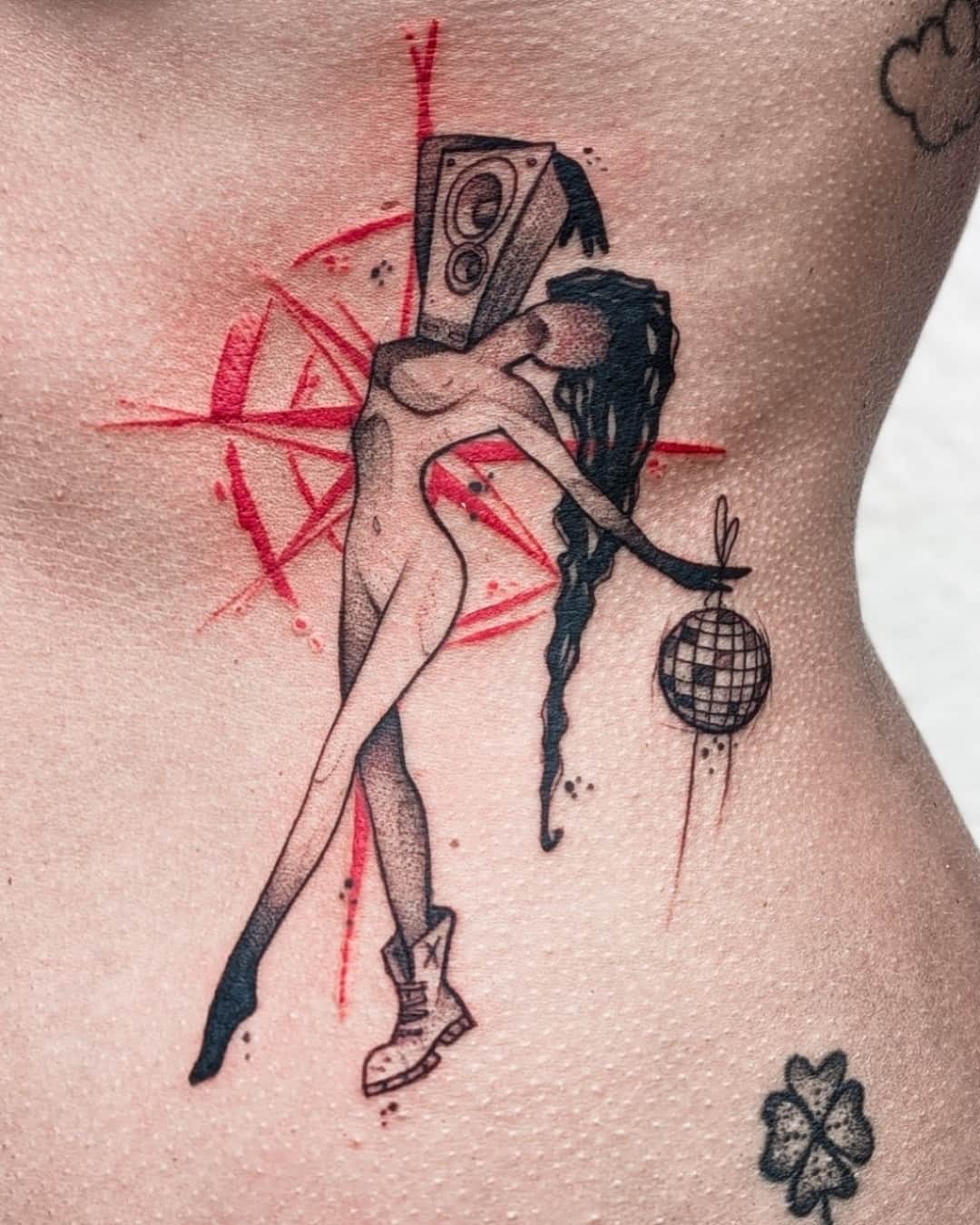
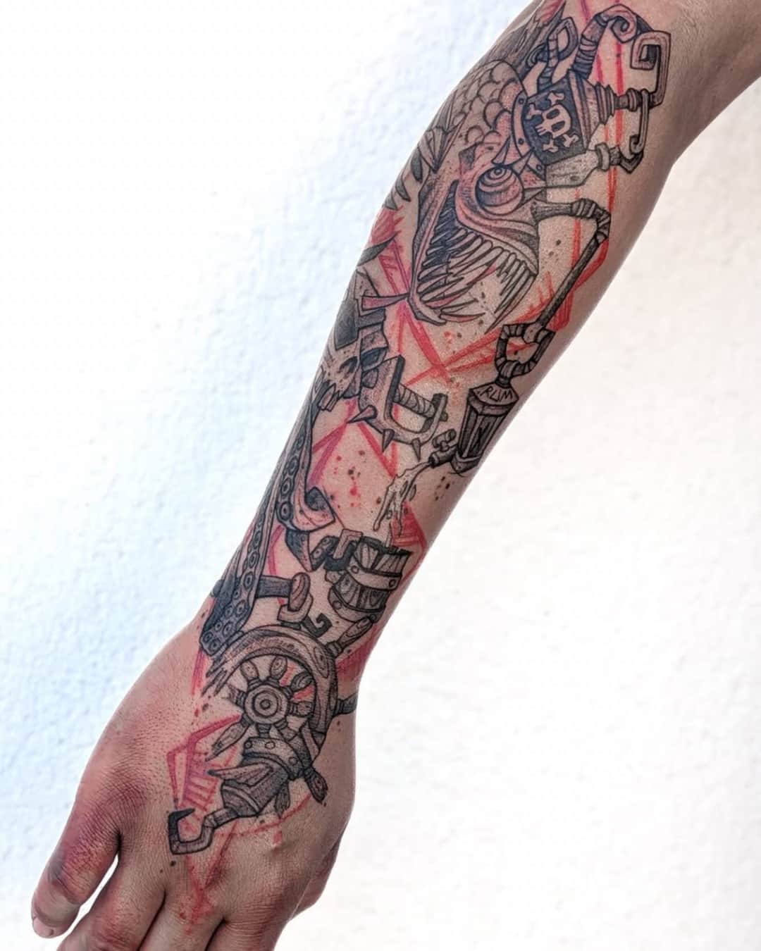
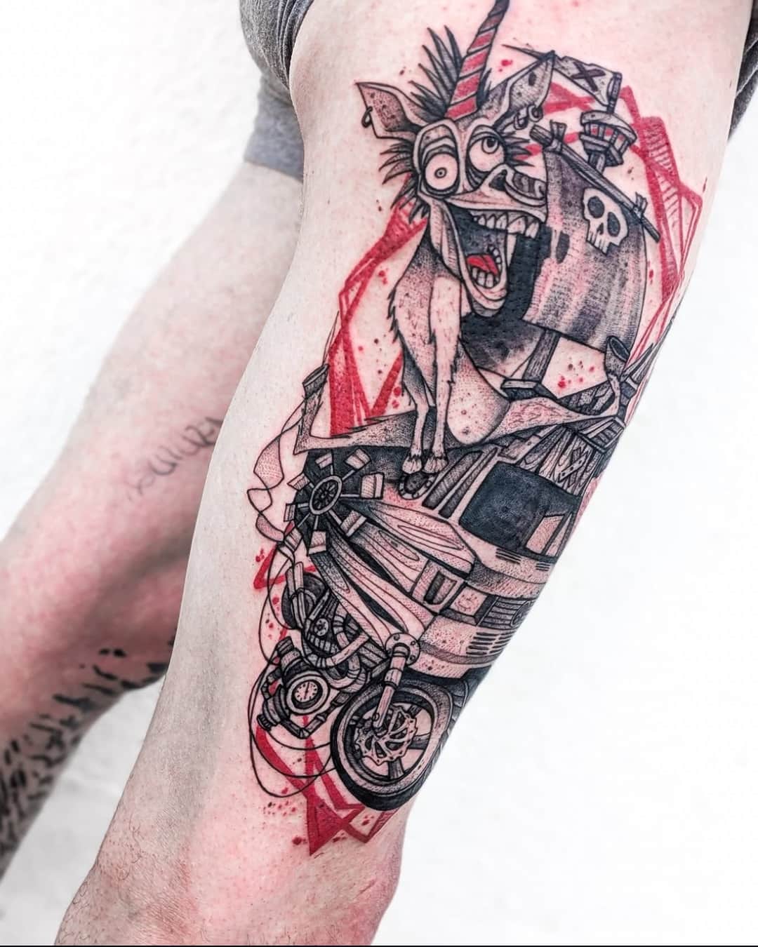
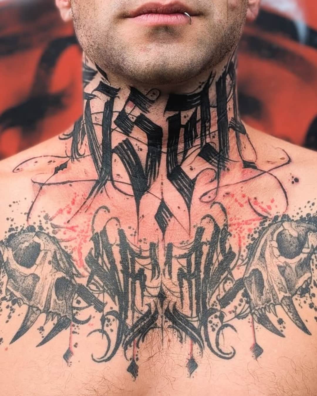
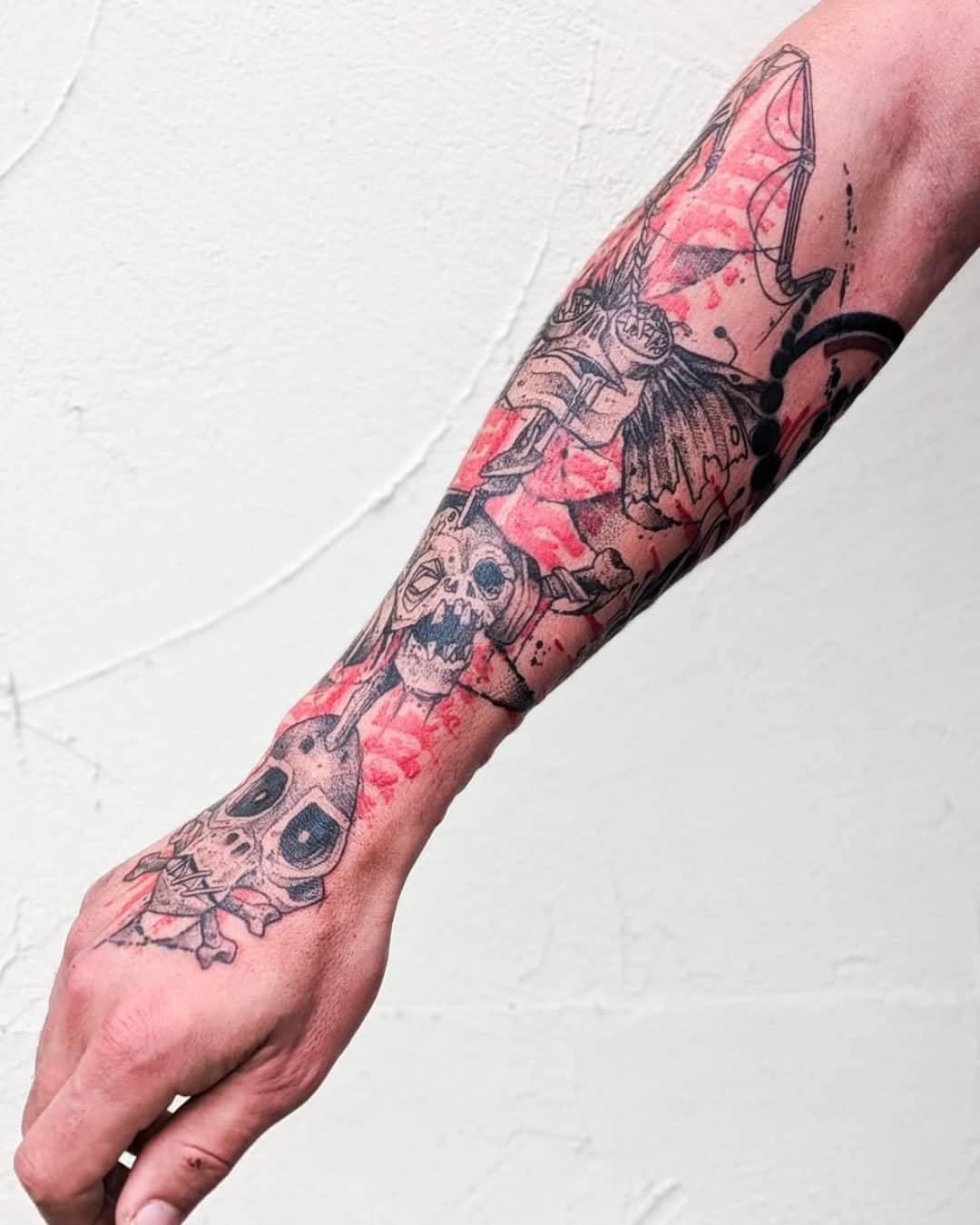
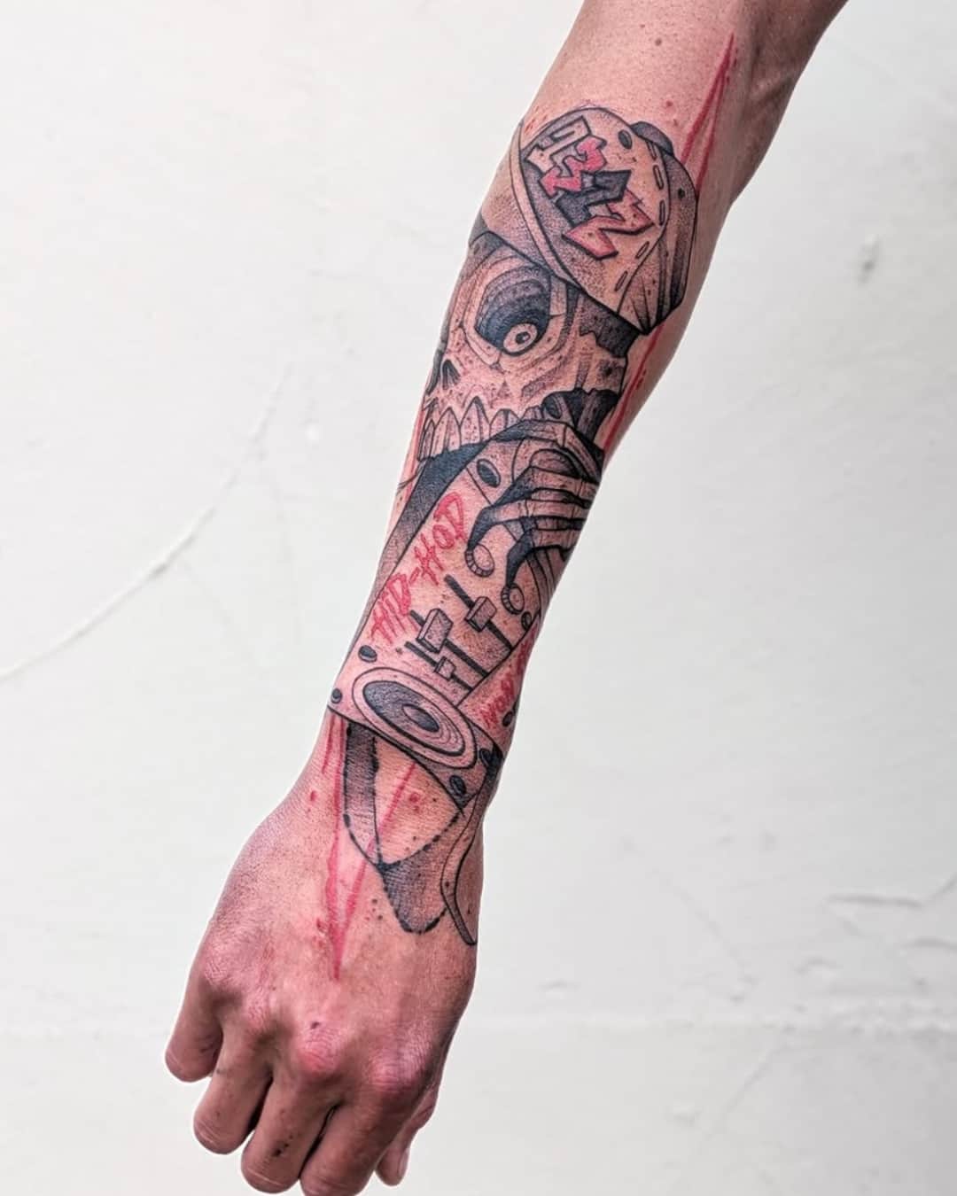
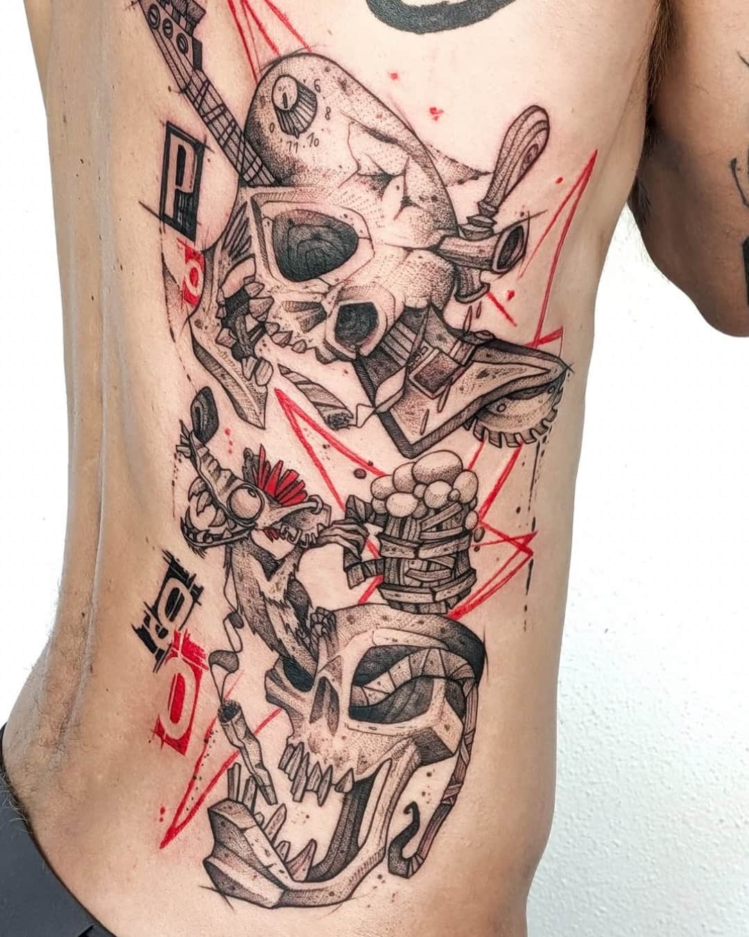
Trash Polka uses nothing but black and red: a piece of photorealism, and the raw gesture that tears it up.
On YokoFolio, pick the style Trash Polka and then your city, and widen the radius without hesitating: few shops really do it. What gets judged is the balance between the two halves — clean realism on one side, decisive red gesture on the other. When one crushes the other, the piece doesn't work. Check the density of the black on healed work too: it's what carries the whole structure.
Strong subjects that can take being crossed out: a raven, a phoenix, a rose, a wolf, a skull, a clock, a portrait, a hand. Fragments of text and blocks of type are part of the vocabulary. Pick a design whose silhouette reads from a distance — the red and the scratch-outs will come in and contradict it, and that contrast is exactly what makes the style.
It's its natural format. The style is a collage: it needs room to make a realistic image, free gestures and blocks of text cohabit without everything stepping on everything else. Below a full forearm, the contrast gets lost. Full arm, back, chest or thigh suit it best. The work is counted in sessions, based on time spent and the artist's rate: ask for an estimate once the layout is approved.
It's a crossover that's become common: the figures of the Japanese repertoire — dragon, koi, hannya mask, wave, cherry blossom — handled with trash polka grammar, in black and red, with scratch-outs, blots and blocks of text. The result keeps the readability of the Japanese designs and adds the graphic violence of collage. Tell your artist up front if that's what you're after: not everyone who does one does the other.