Filters

2 tattoo artists
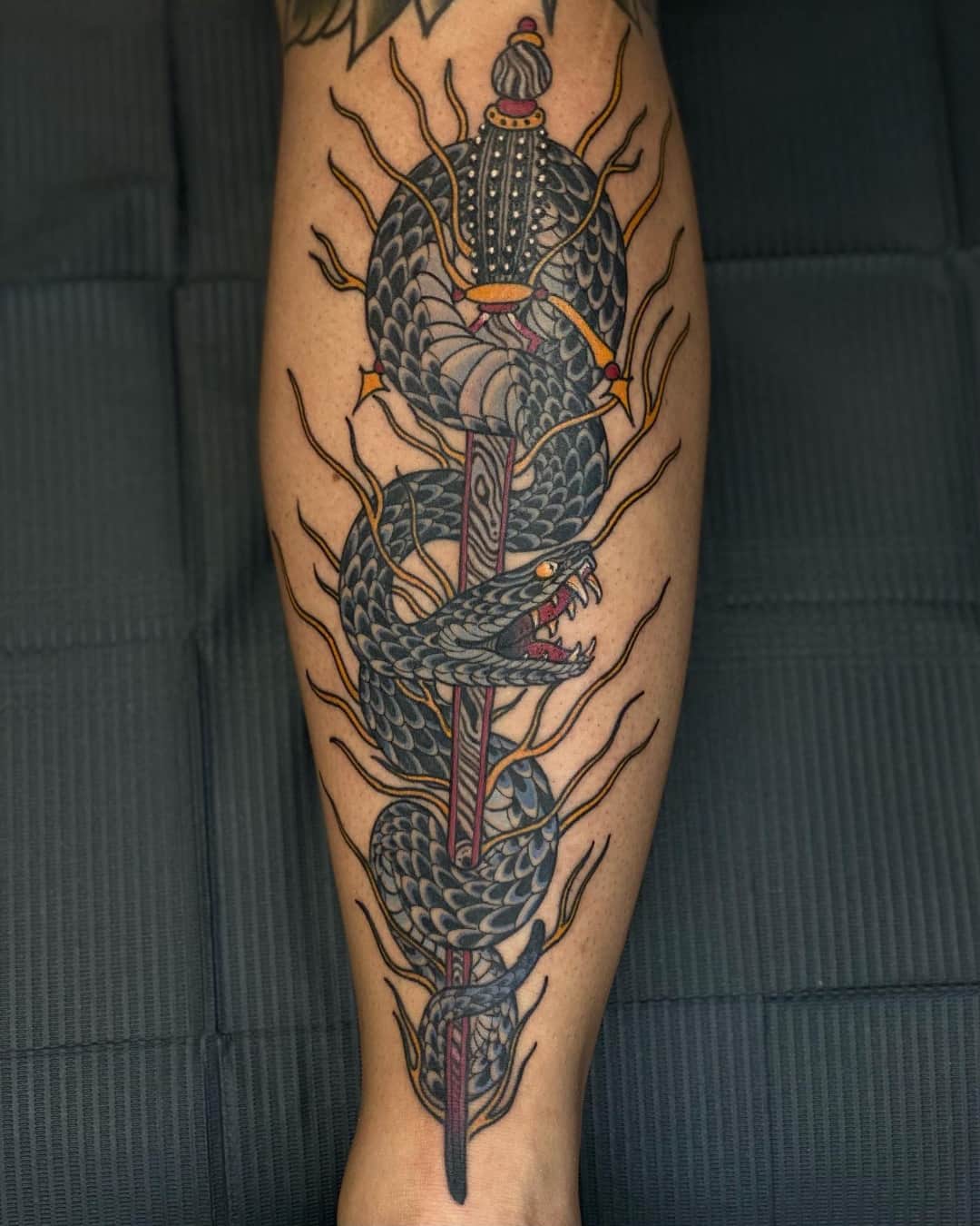
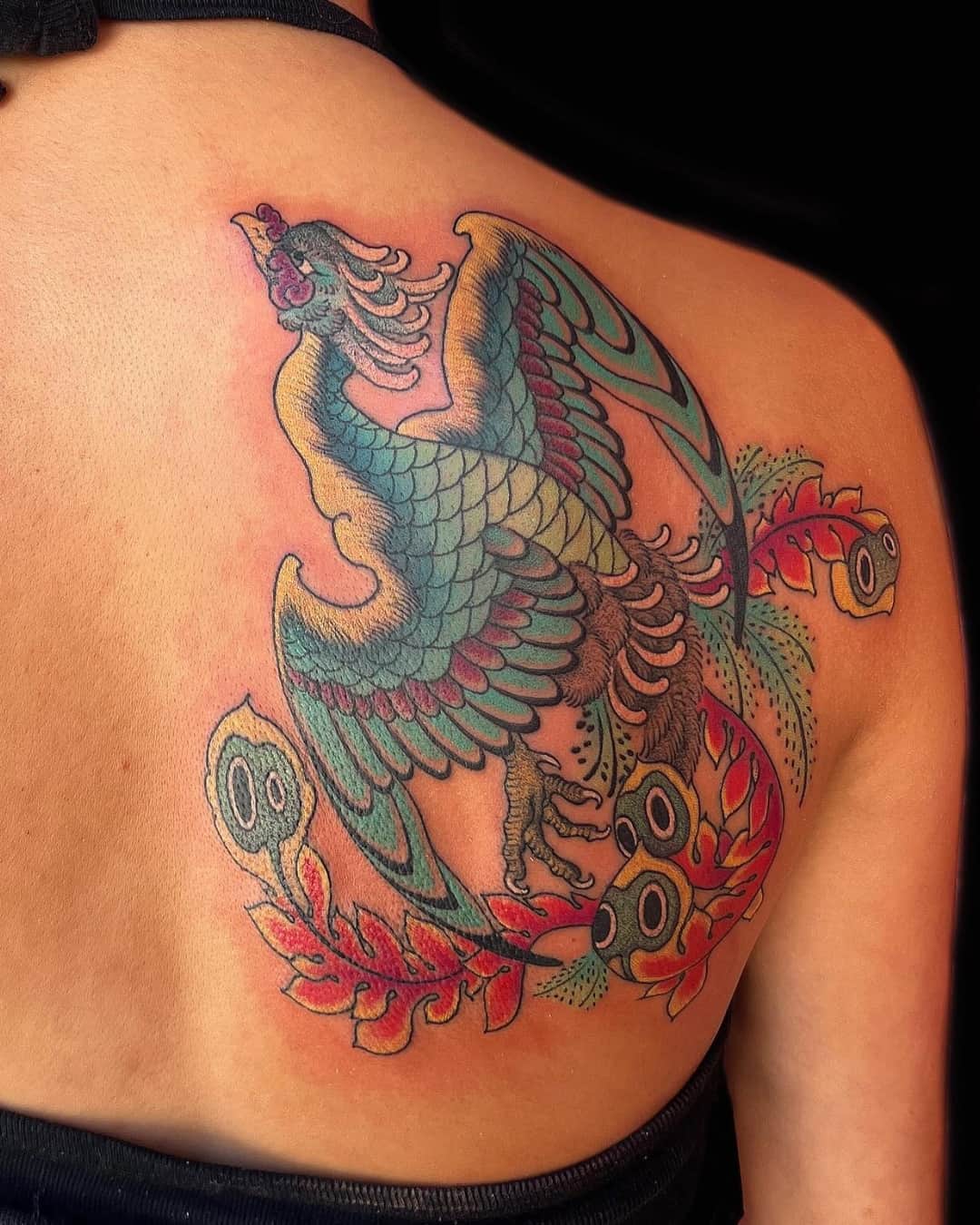
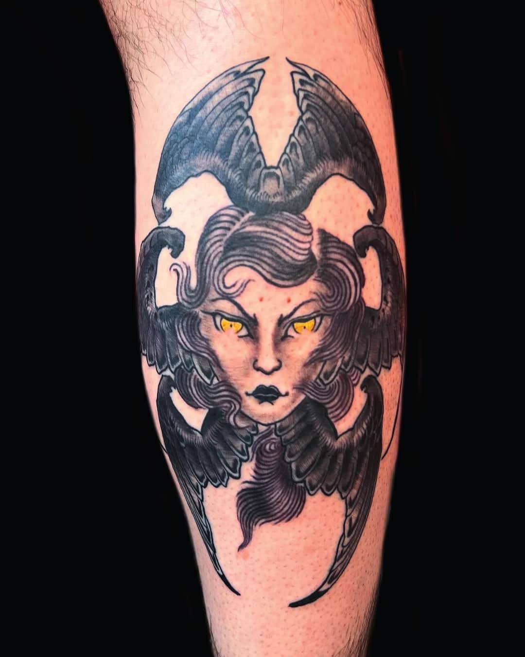
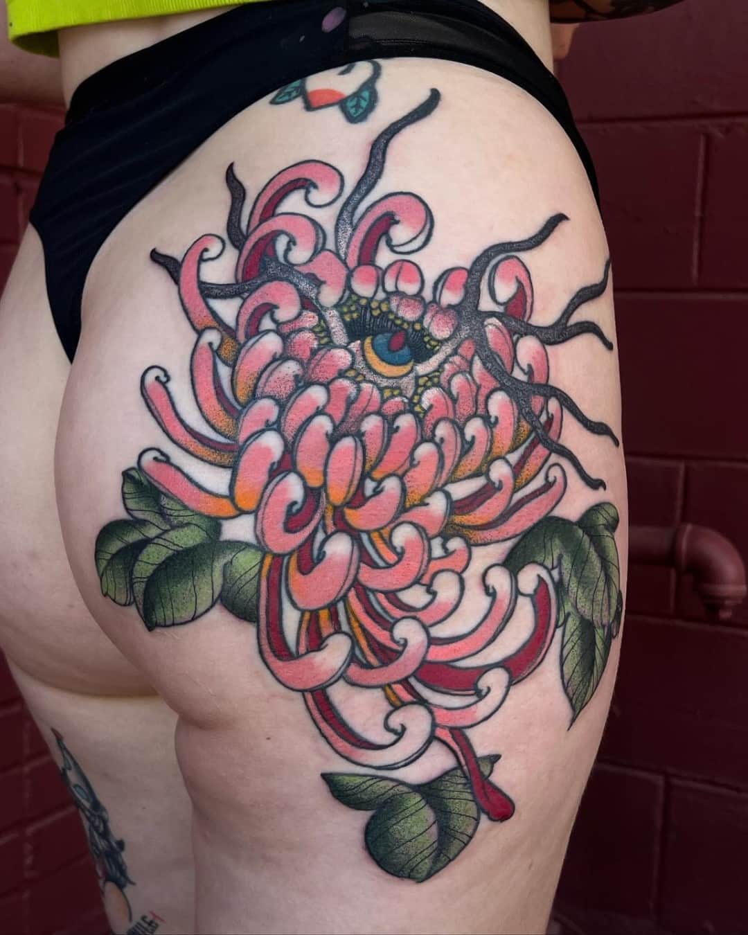
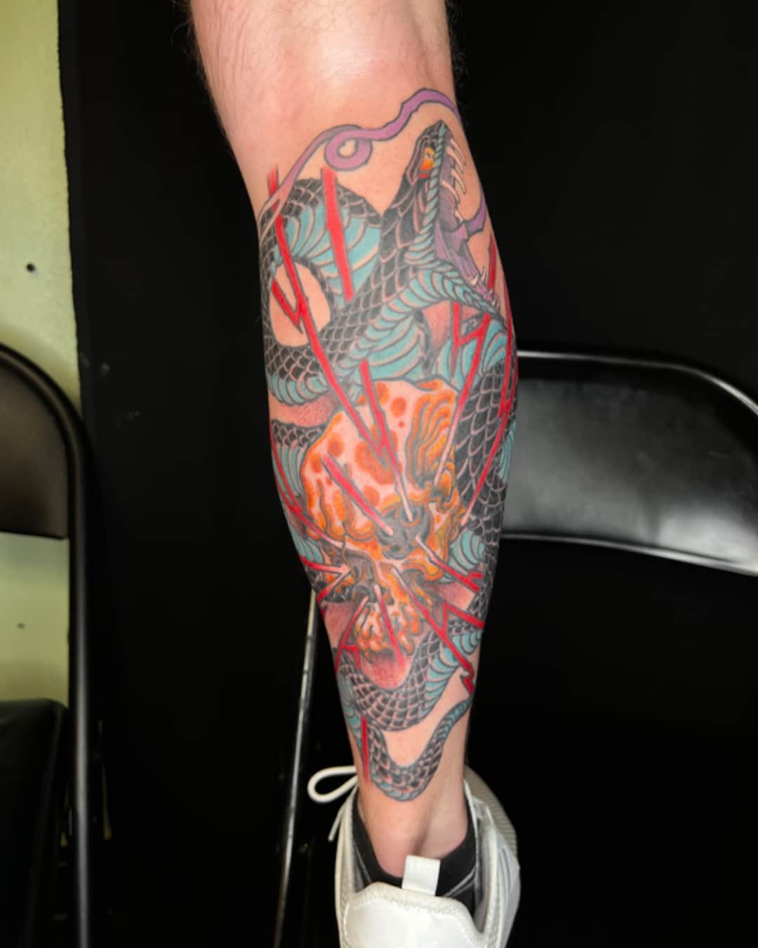
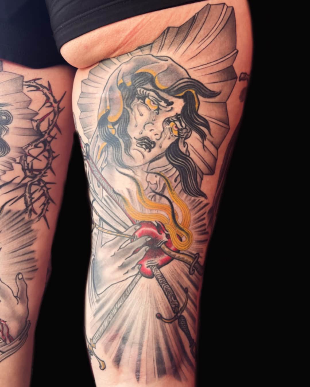
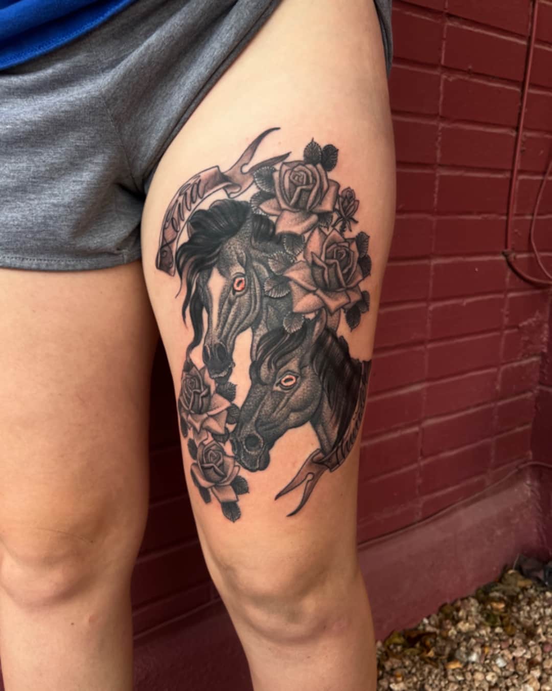
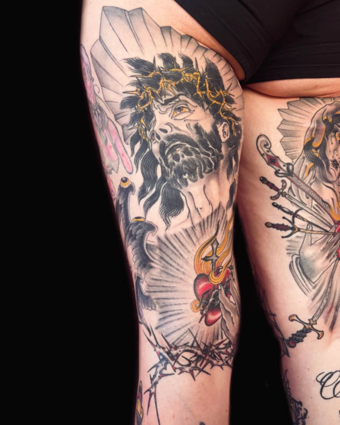
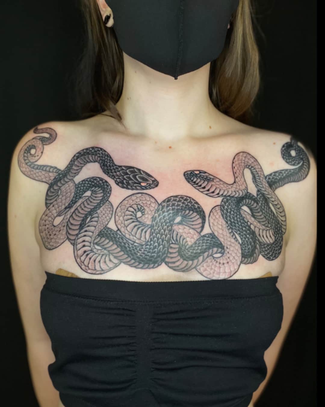
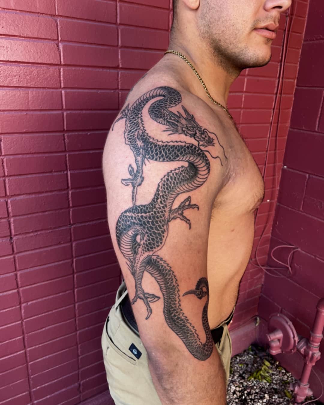
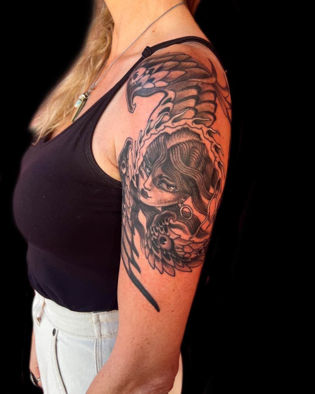
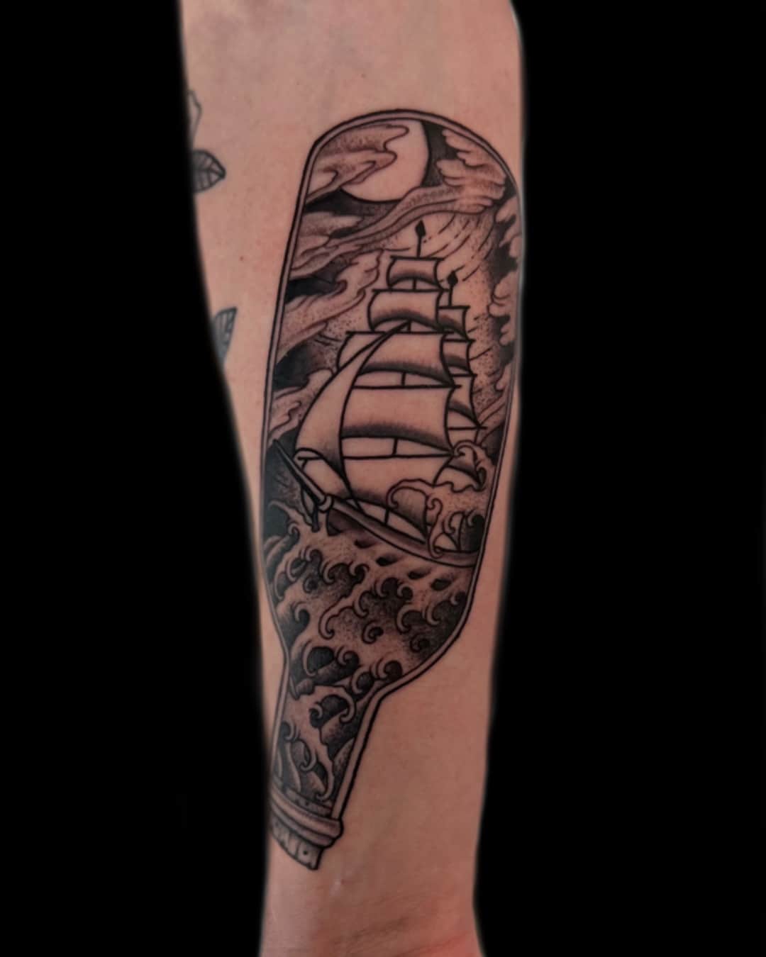
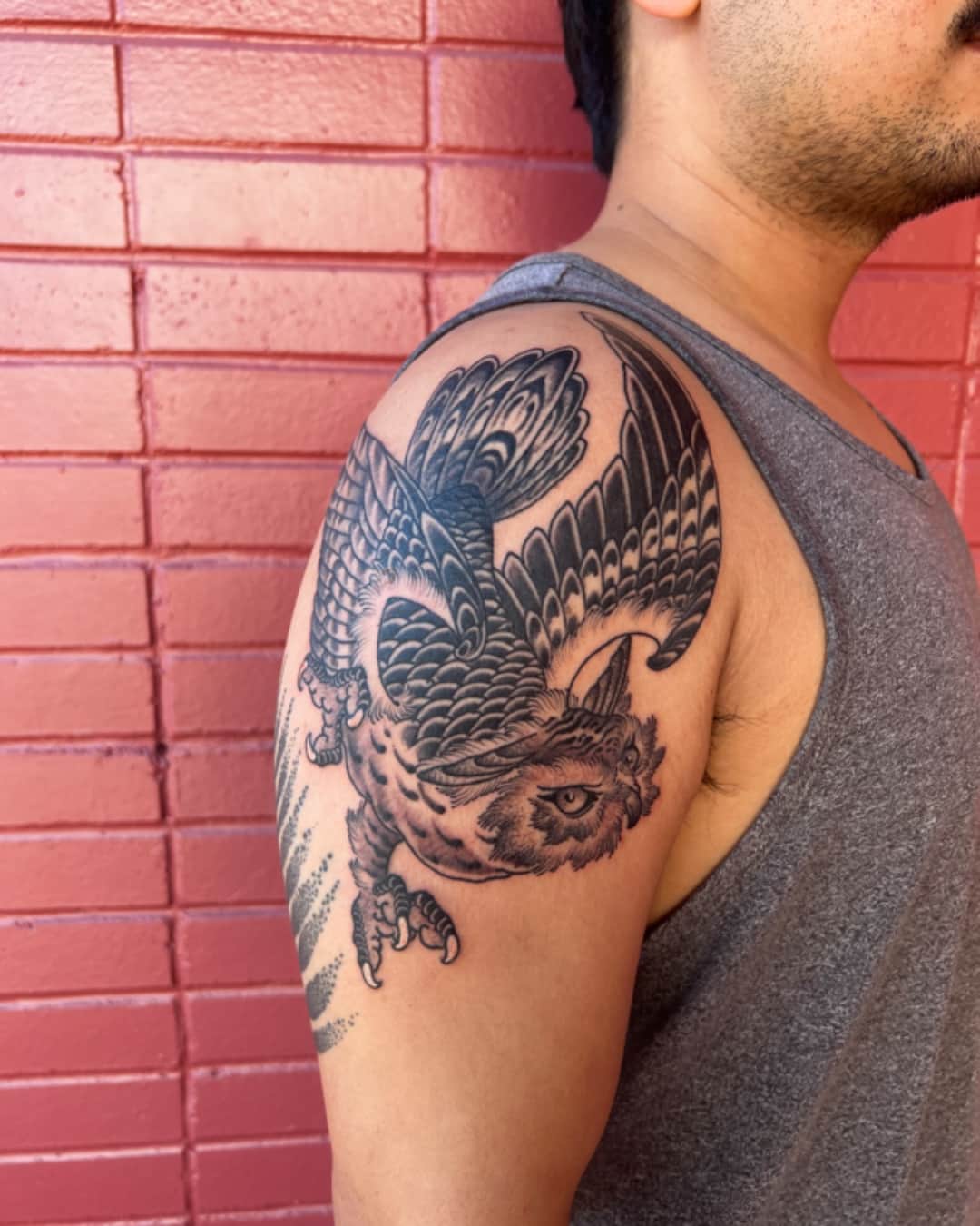
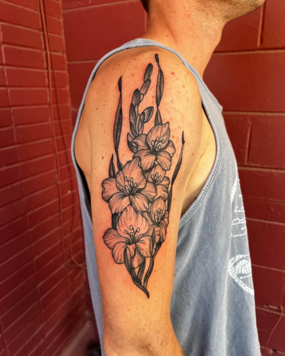
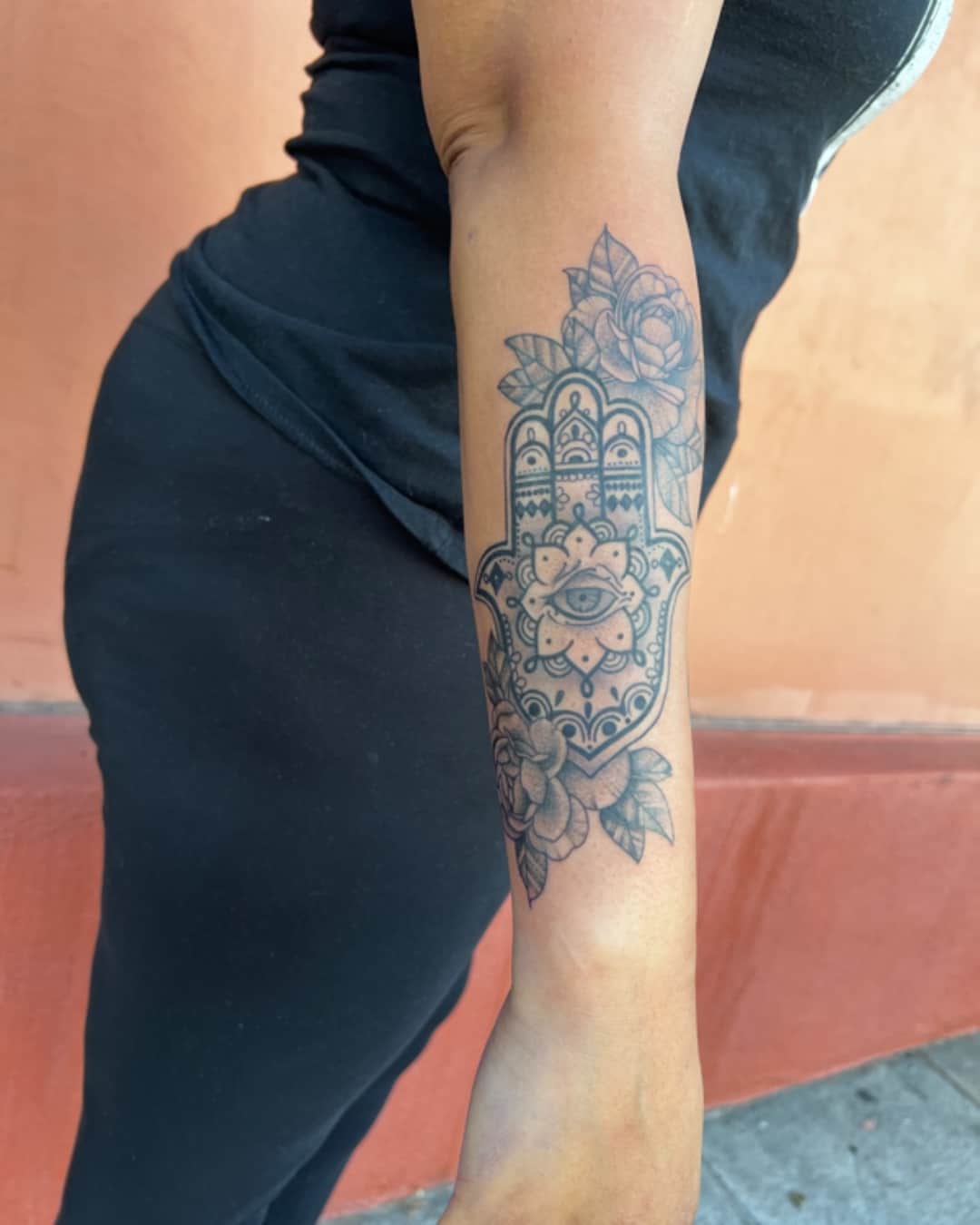
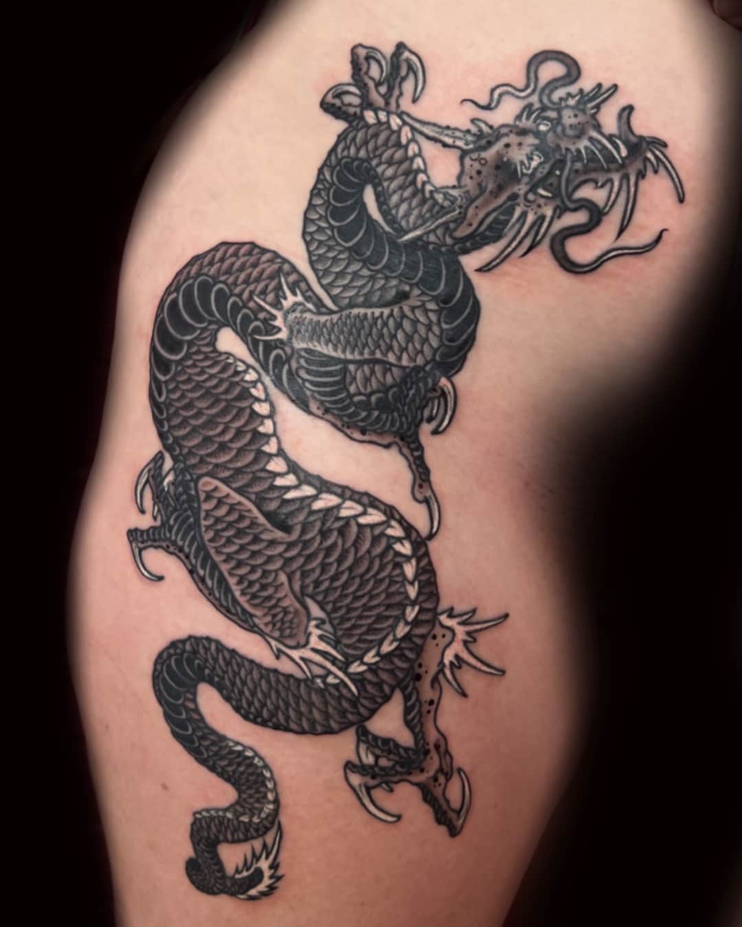
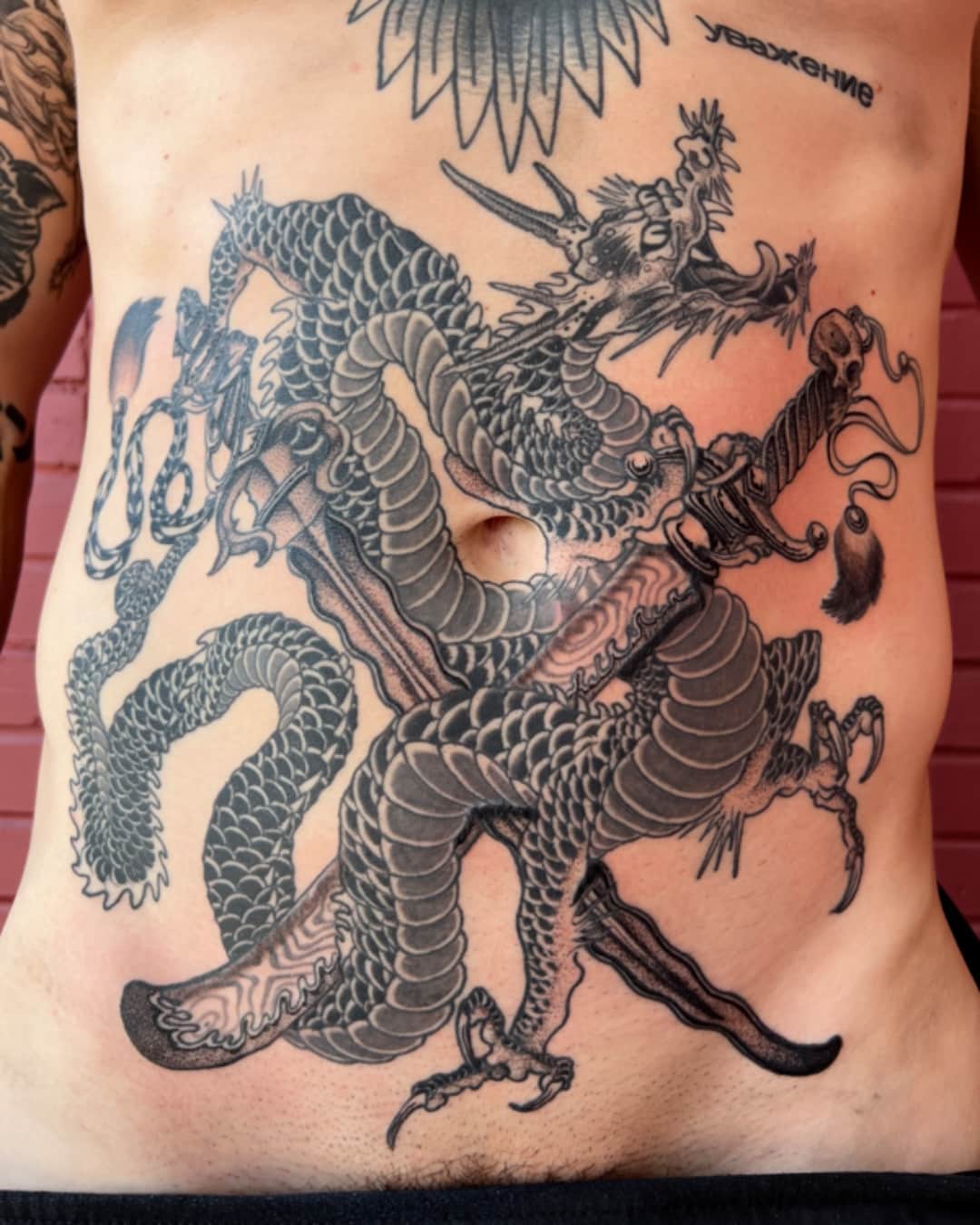
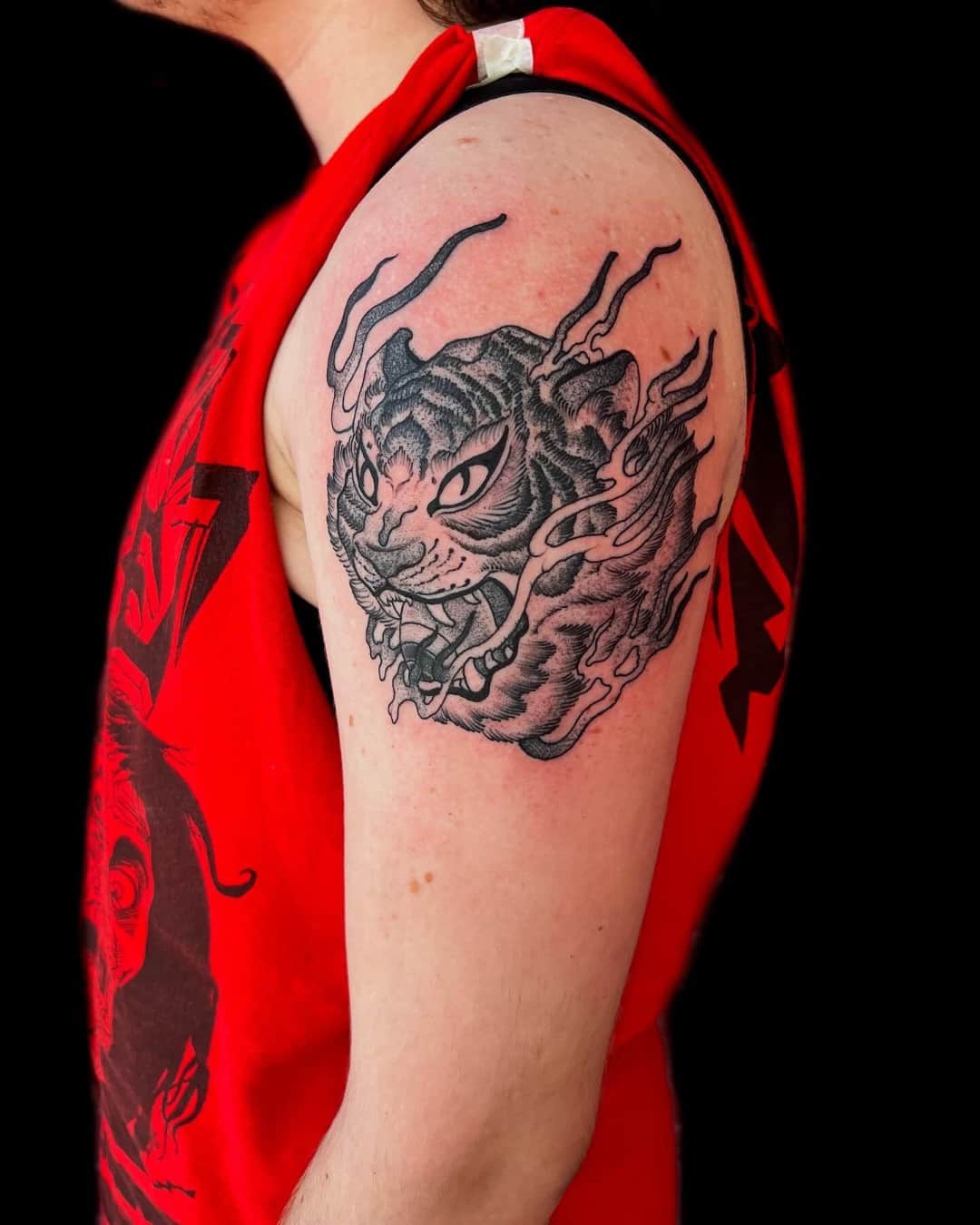
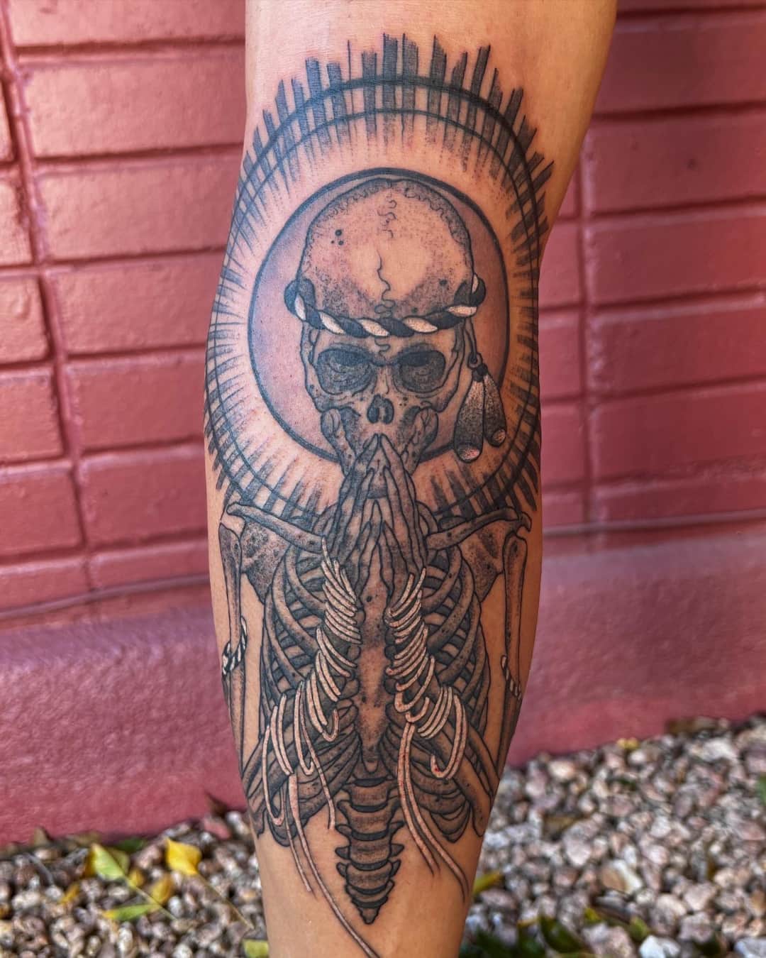
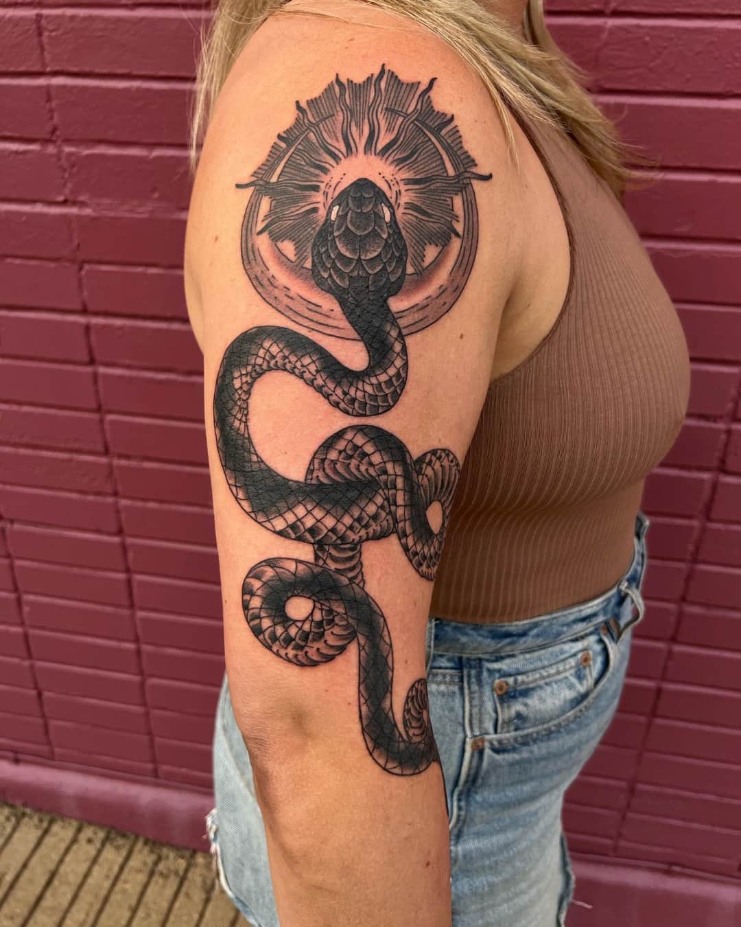
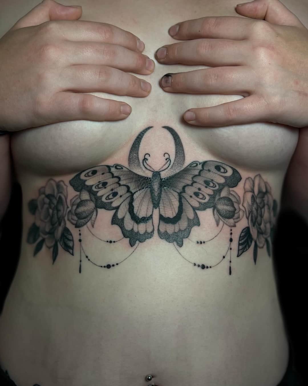
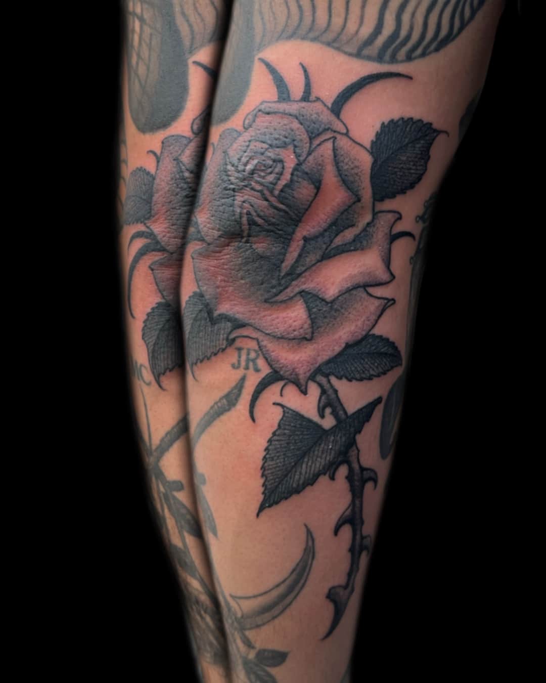
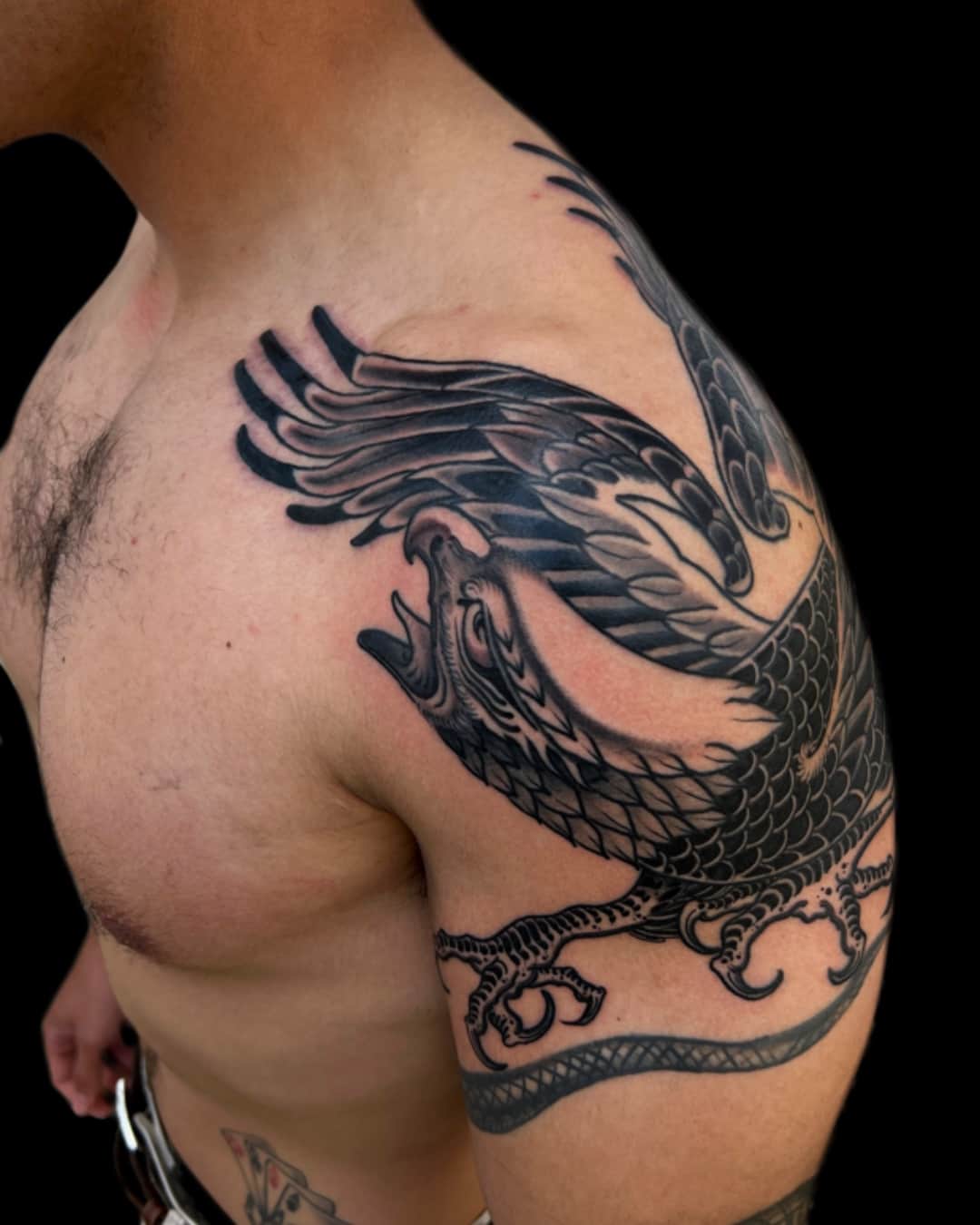
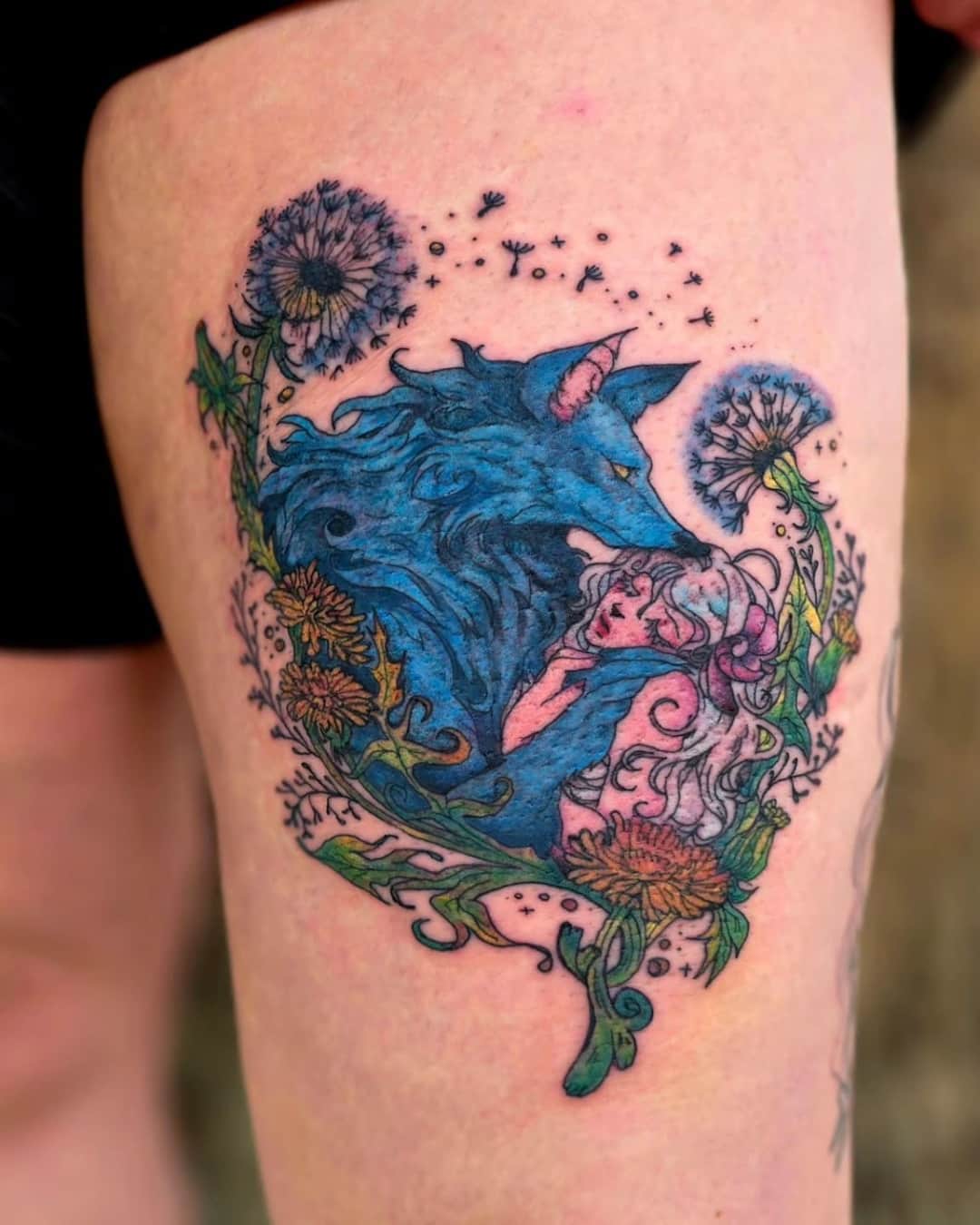
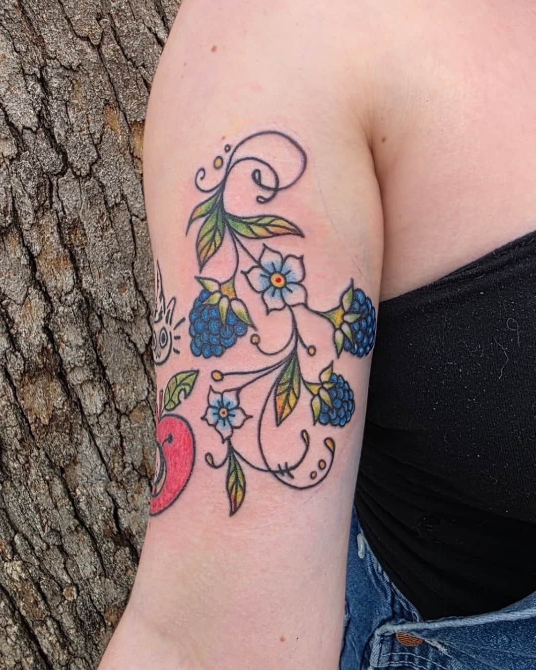
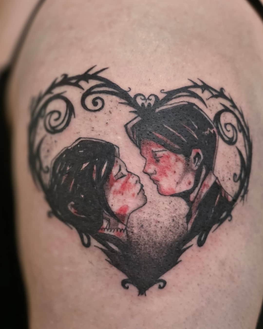
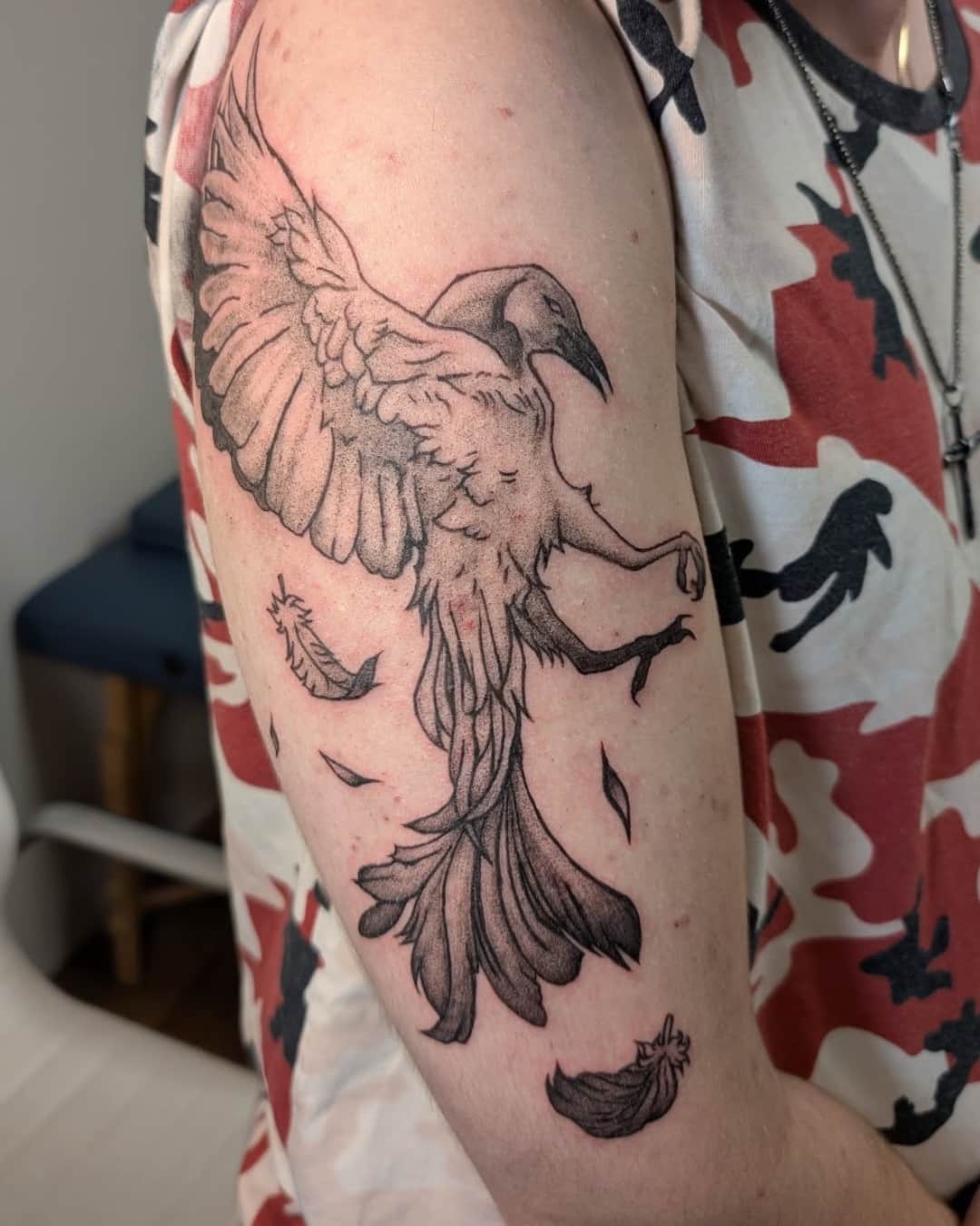
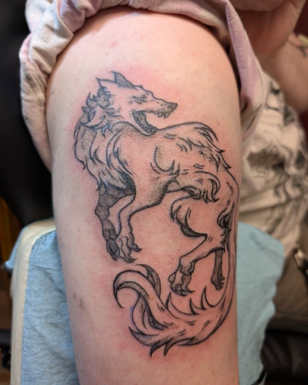
Illustrative tattooing owns the fact that it's a drawing: modulated line, hatching and texture, somewhere between engraving and a comic page.
On YokoFolio, pick the style Illustrative and then your city, and widen the radius if you need to. Look at the images rather than the label: the word covers work that has almost nothing in common. The best indicator is the drawing itself — ask to see sketchbooks or preparatory work, because here the quality of the tattoo comes straight from the quality of the drawing. And look for healed pieces where the hatching still breathes.
Realism aims at illusion: no outline, continuous values, a texture you're meant to believe. Illustrative owns the line, the hatching and the stylization, and keeps the artist's hand visible — it's a drawing on skin, and it says so. For a family portrait, realism is usually the call. For an animal, a plant or a scene, illustrative gives more character — and it ages a little better, because it rests on lines.
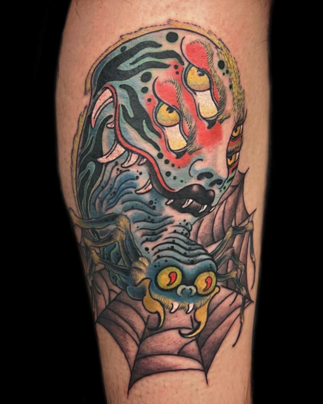
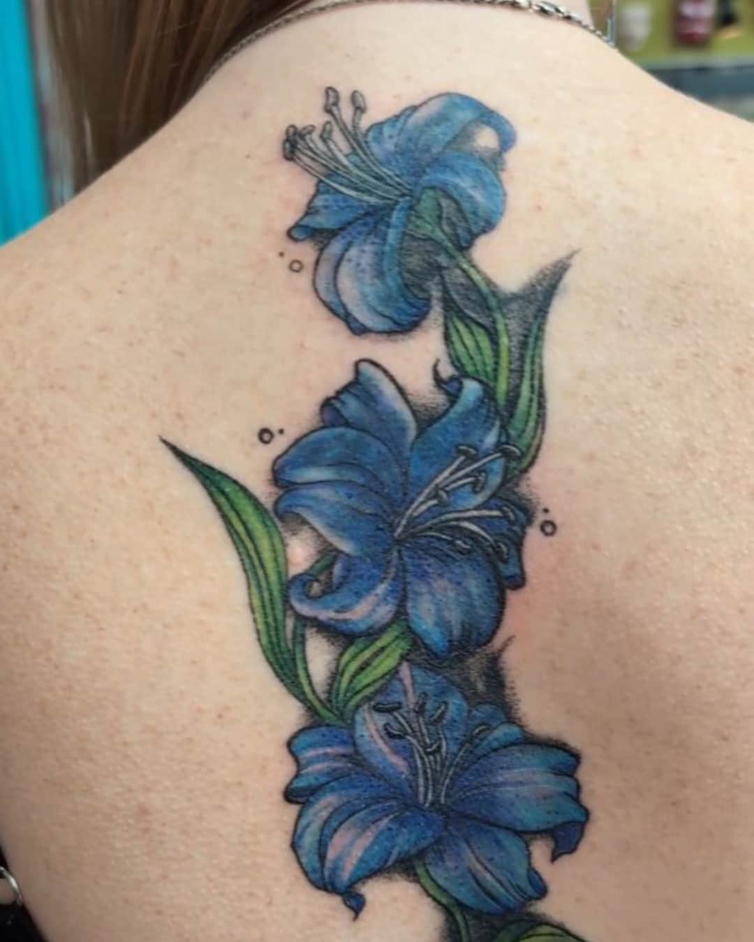
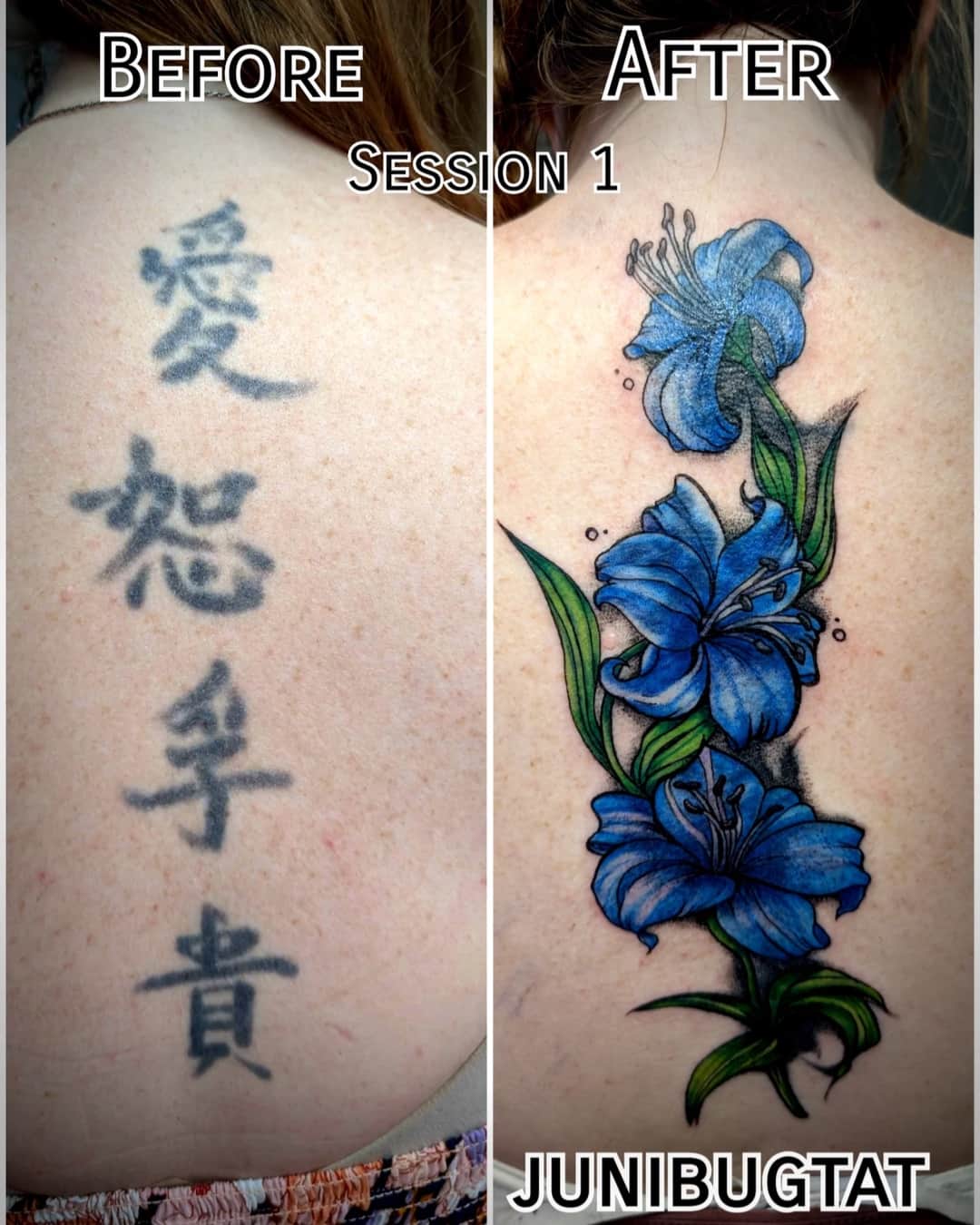
Both, and the choice changes the result a lot. In black and grey the style moves toward engraving and book illustration: hatching, texture, hard contrast, and excellent durability. In color it moves toward children's-book illustration or poster art, with flat areas and atmosphere. Black and grey is more forgiving and fits more easily alongside other pieces; color has more immediate presence.
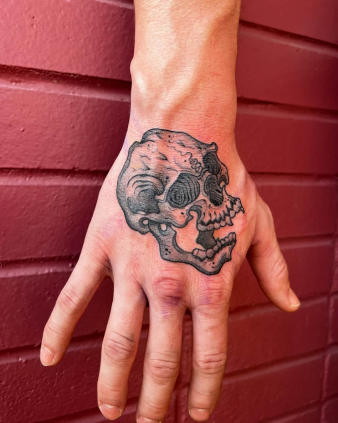
It's a version in high demand: gothic, occult or macabre imagery — skulls, ravens, hands, moths, saints, tarot cards — treated in line and hatching, almost always in black. It borrows from old engraving and from anatomical plates, with deep blacks and a lot of texture. It's one of the few styles where density is part of the point, so plan for a surface that lets the hatching breathe.