1/5

1 tattoo artist · 1 tattoo studio
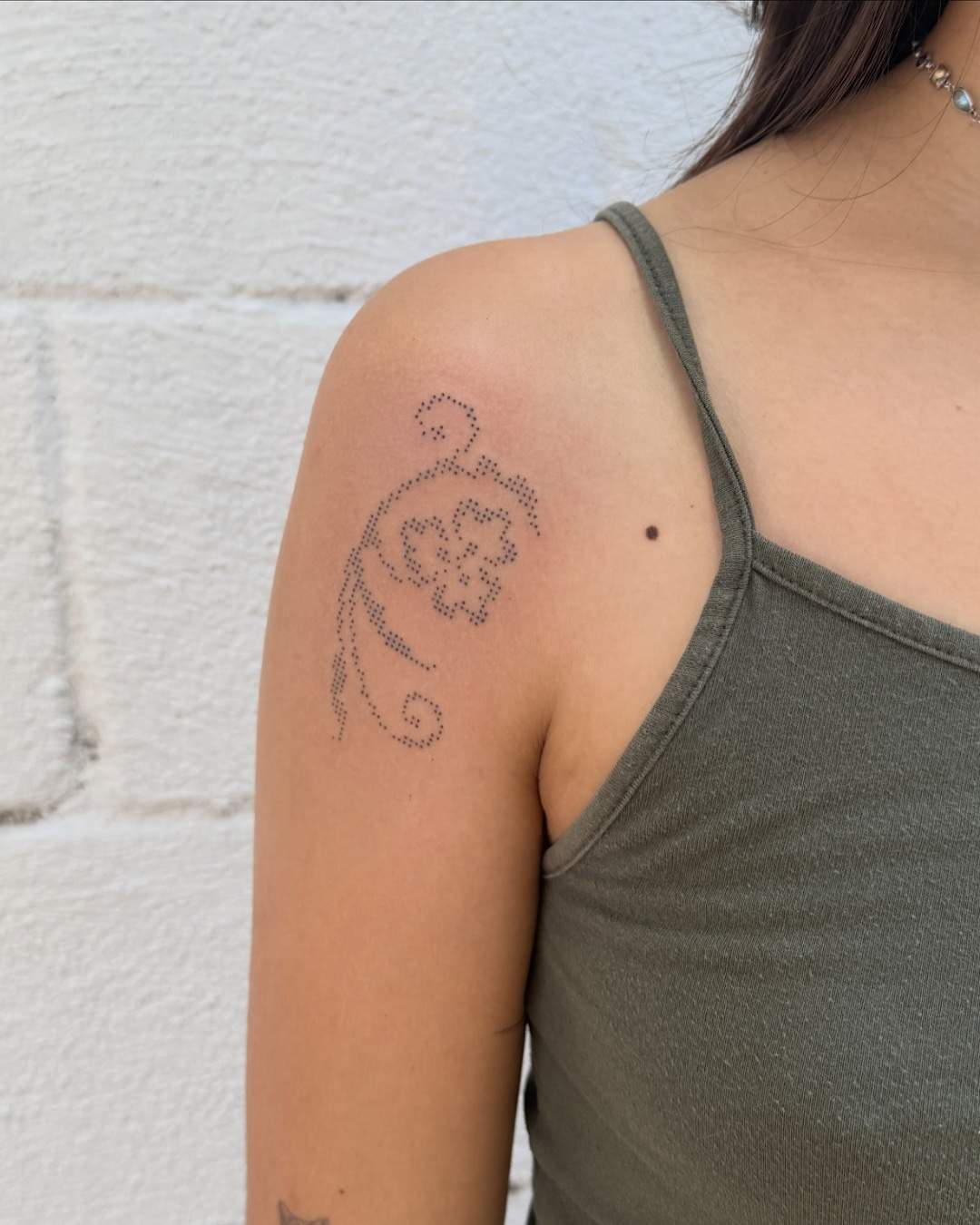
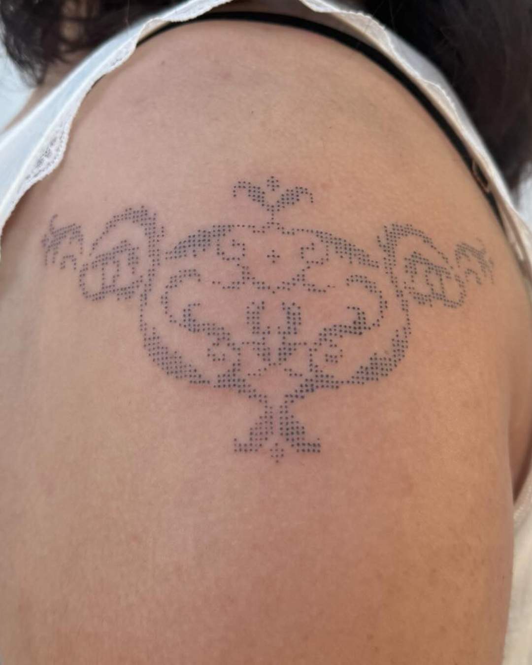
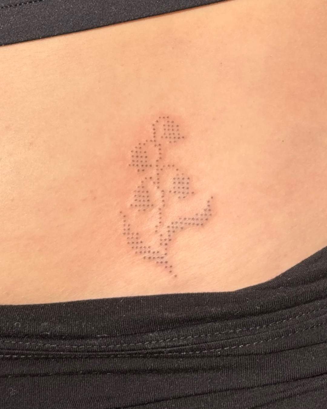
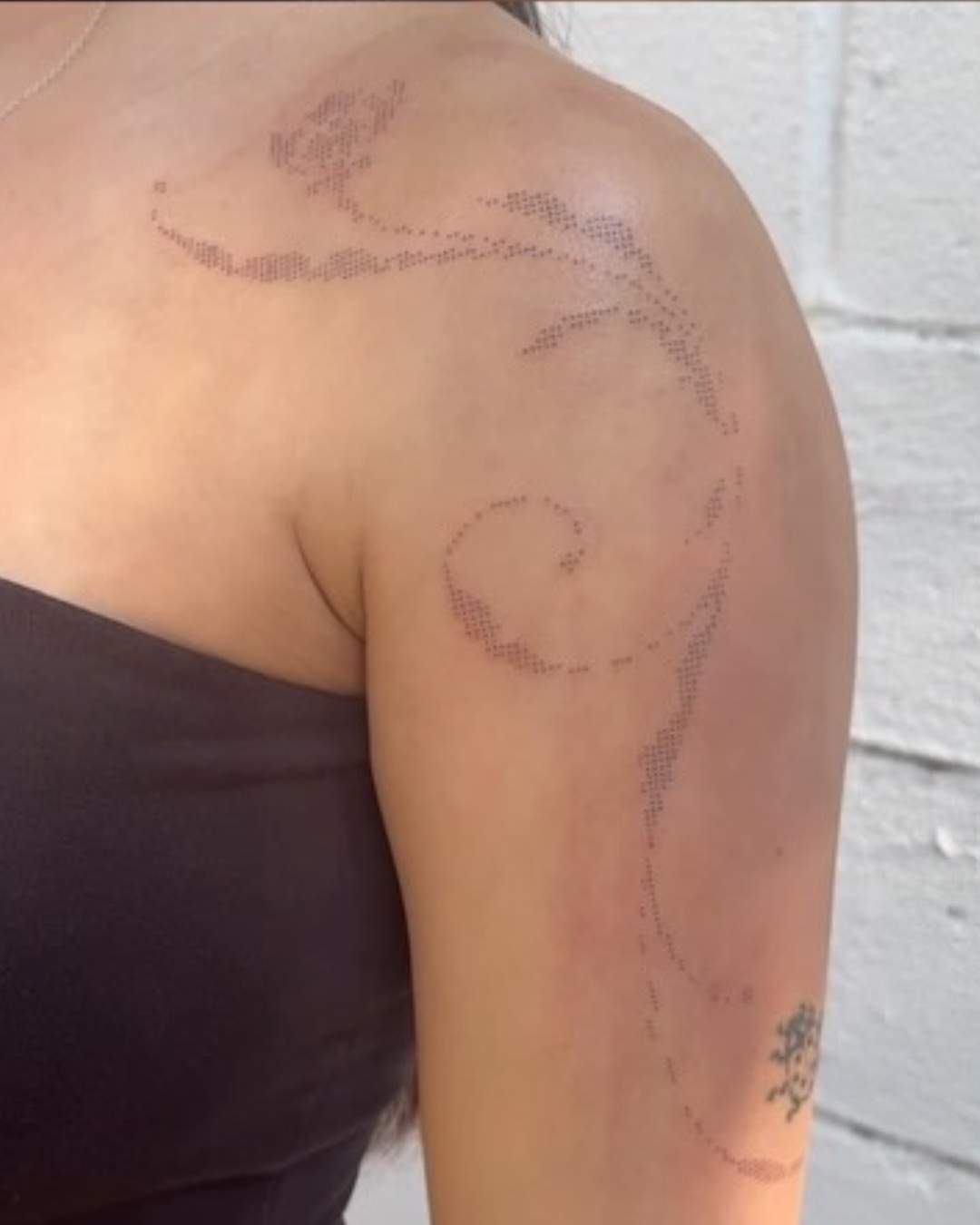
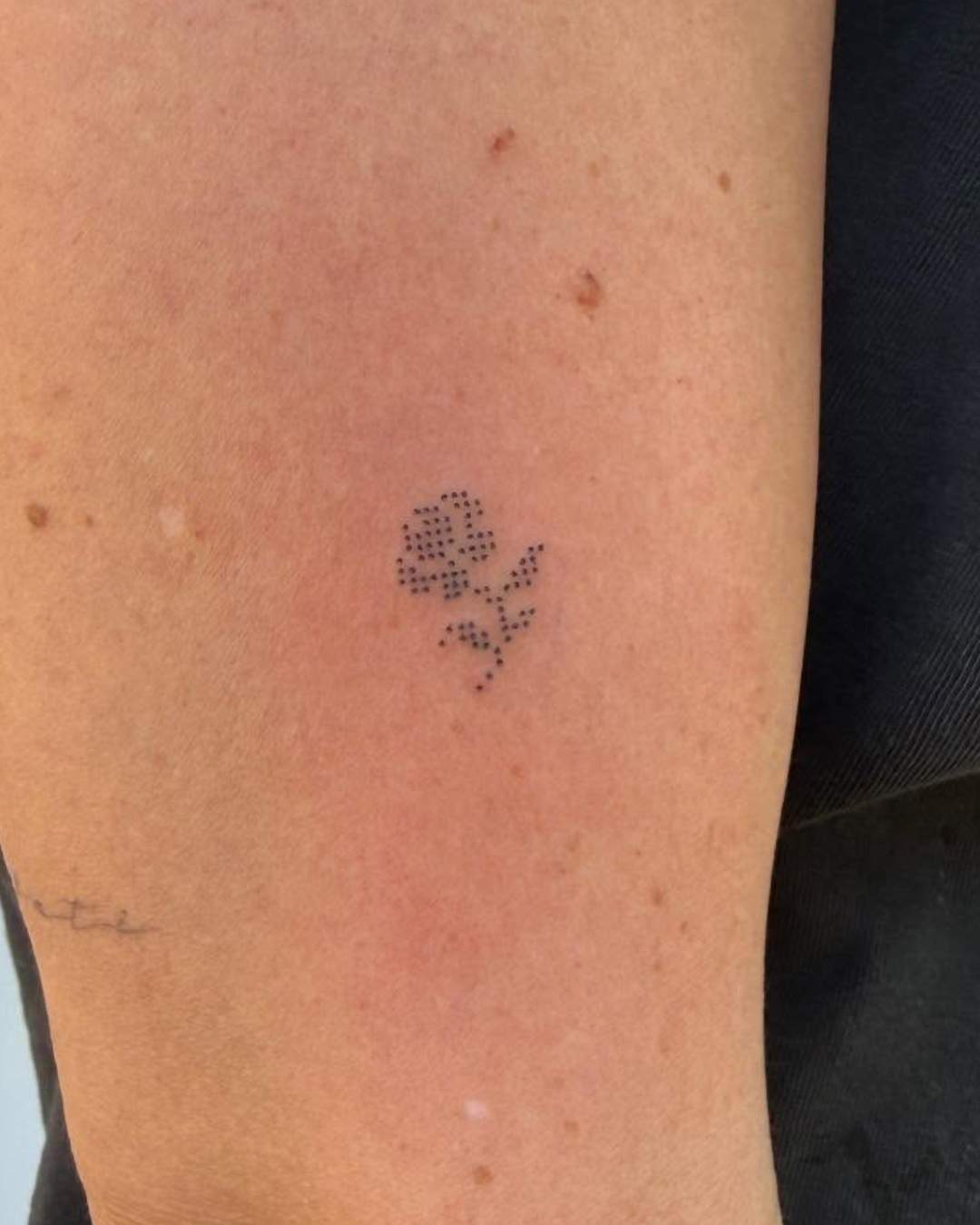
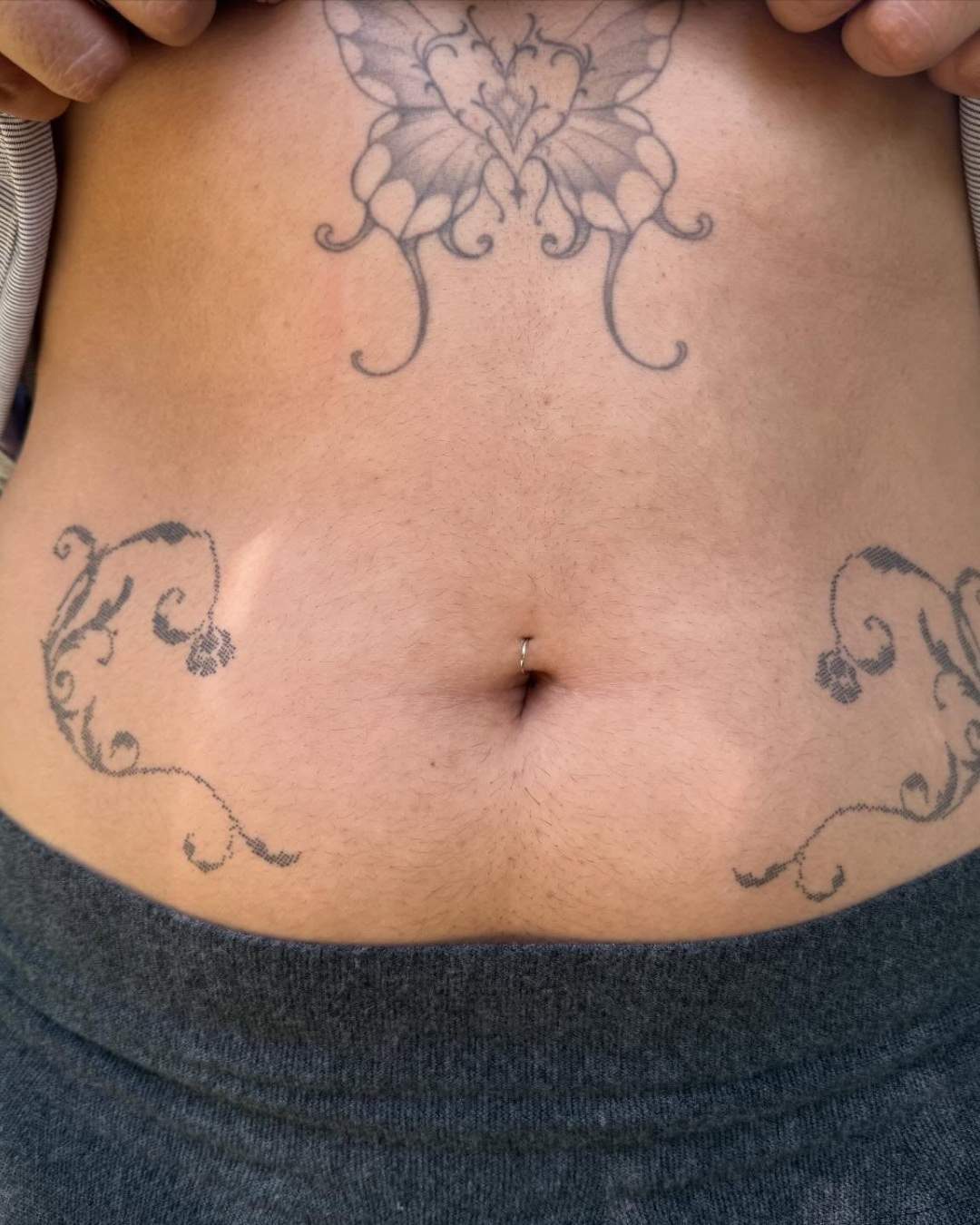
Halftone builds shading only from dots of varying size and spacing, set on a grid like old newspaper and comic book printing.
On YokoFolio, pick the style Halftone and then your city, and widen the radius if the list is short. Look at the regularity of the grid: rows should stay aligned, dots round and clean, and their size should change smoothly to build the tones. Step back from the photo — the image should appear as a whole, like a printed picture. Healed photos tell you whether the dots stayed distinct.
Images that come from print culture: a comic panel, a pop art portrait, a retro advertisement, a newspaper photo, a movie still, a speech bubble, a classic pin-up. Halftone also works as a texture inside another design — a gradient of dots filling a shape, a fade across a sleeve. Strong, simple images with clear contrast read best, because the dots have to carry all the shading.
Large, well-spaced dots usually age well and keep the printed look longer. Very small, tight dots are the risk: as the ink spreads slightly under the skin over the years, they can merge into a flat gray and the grid effect fades. A good artist sizes the dots for your skin and for the size of the piece. If the design has to be small, ask for a coarser screen — fewer, bigger dots last better.
Both are made of dots, but they don't use them the same way. In halftone, the dots sit on a regular grid, like printing, and their size changes to make light and shadow. In dotwork, the artist places the dots freely by hand, and it's the density of the stippling — many dots or few — that makes the tone. If you see a mechanical grid, it's halftone; if the dots are scattered by hand, it's Dotwork.