Filters

2 tattoo artists · 1 tattoo shop
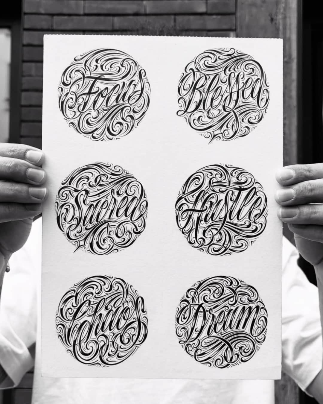
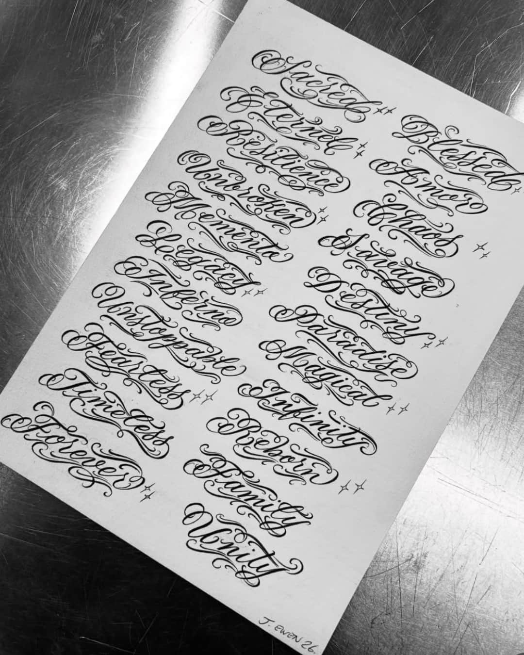
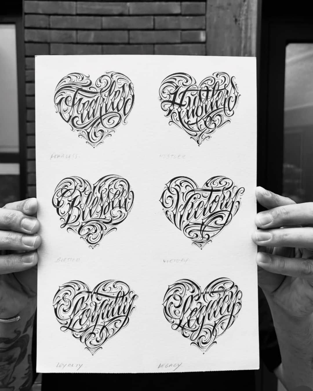
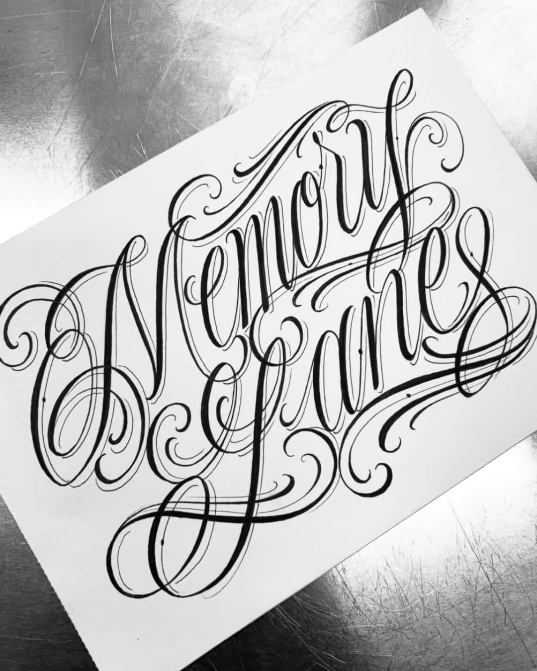
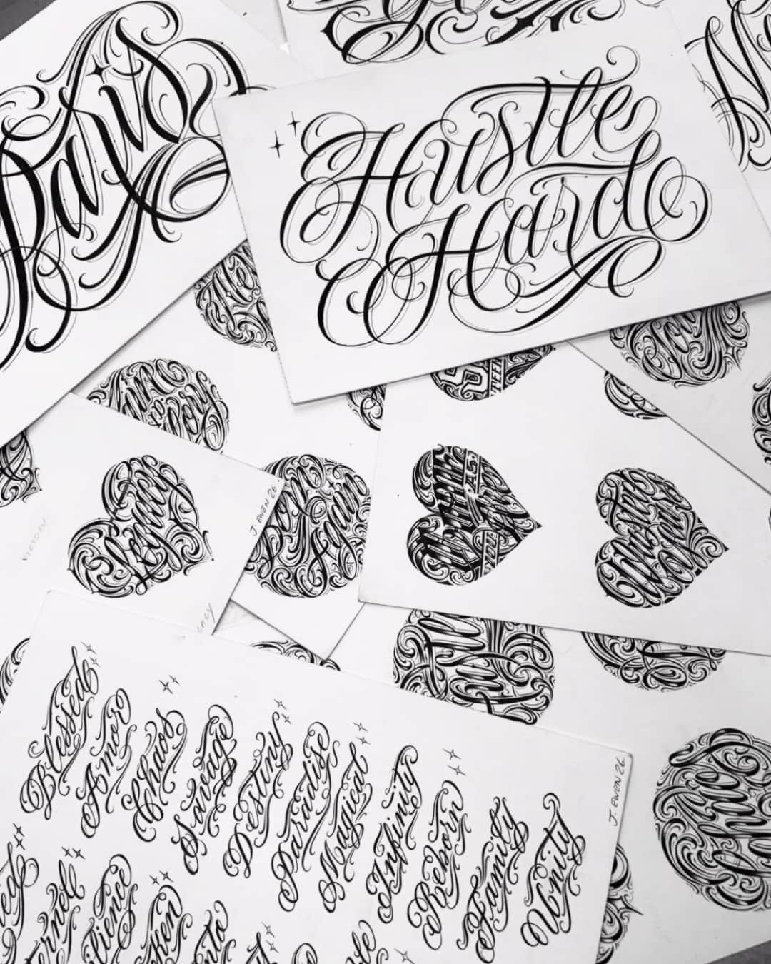
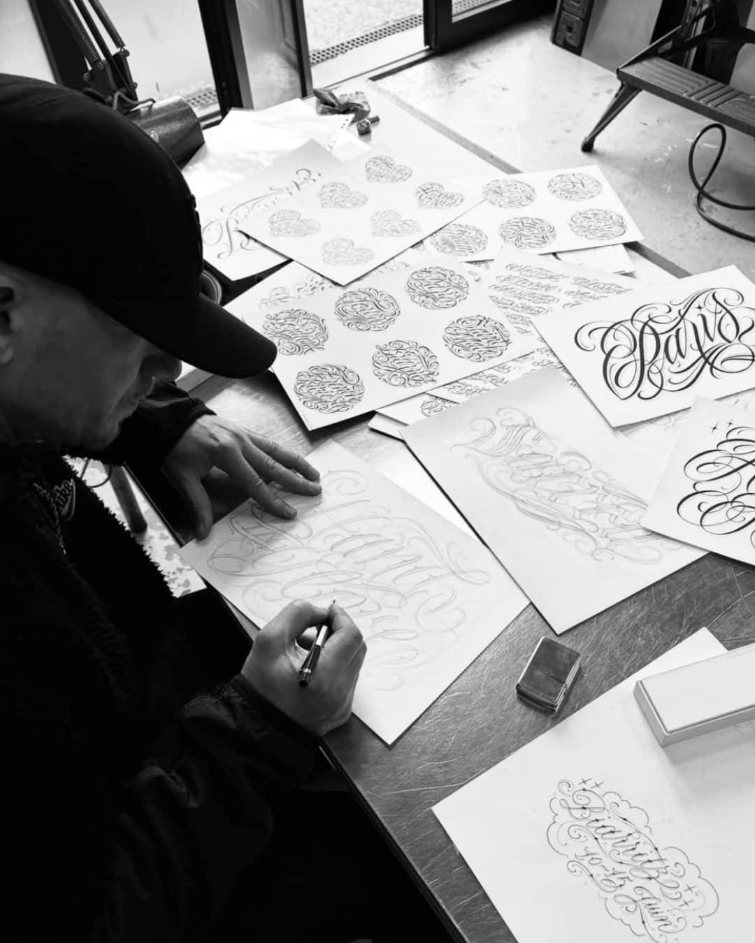
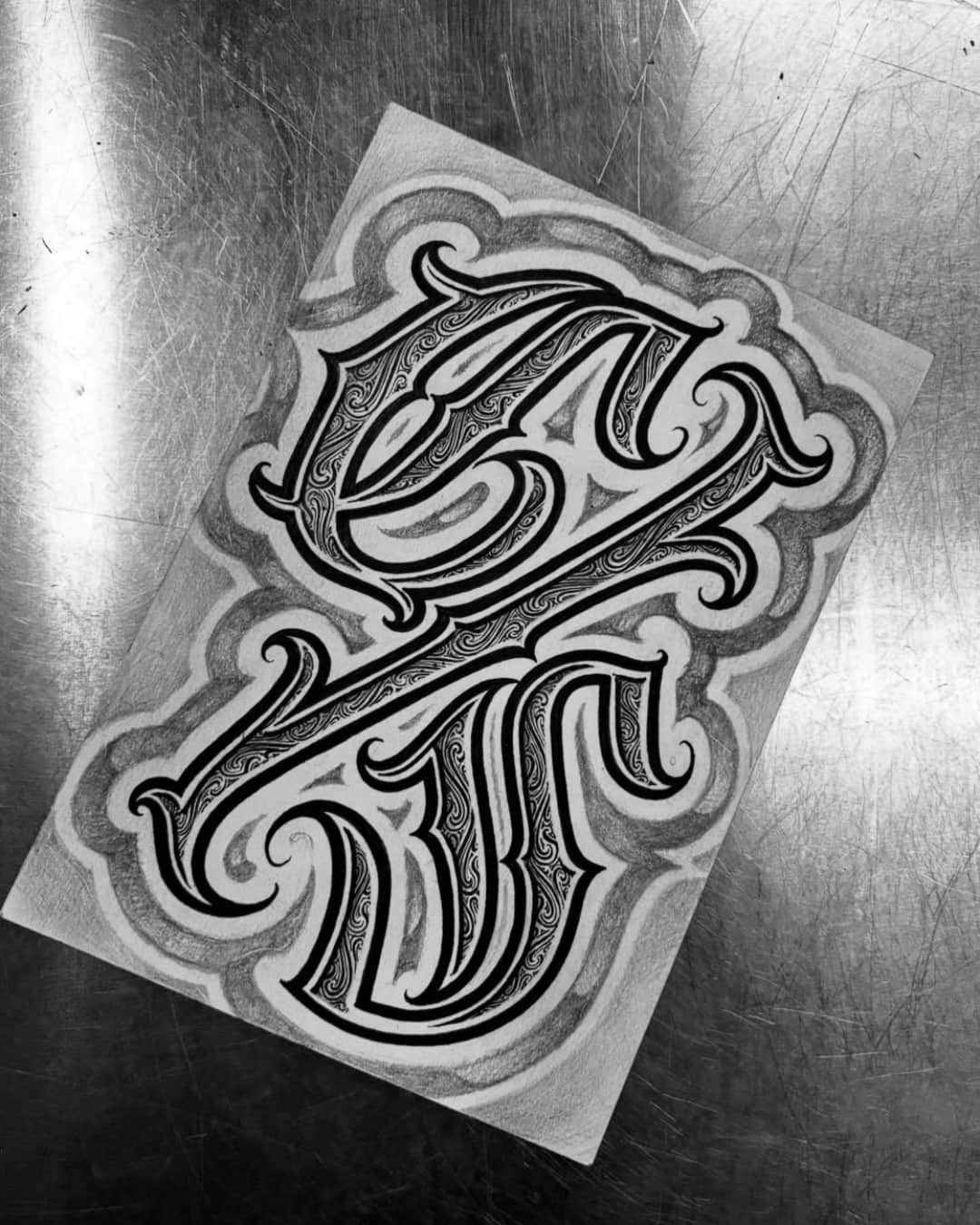
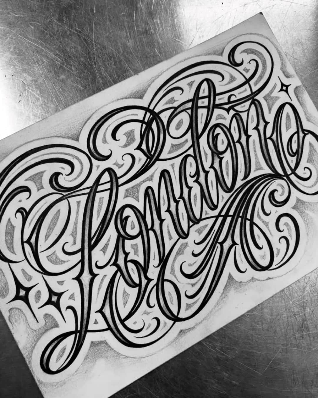
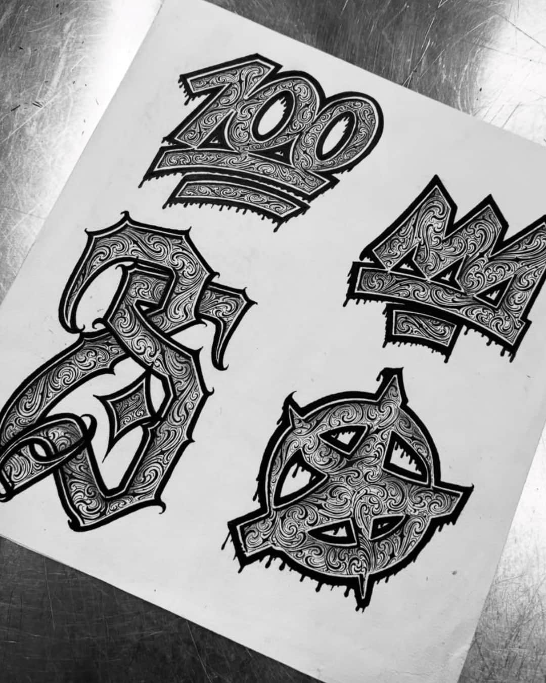
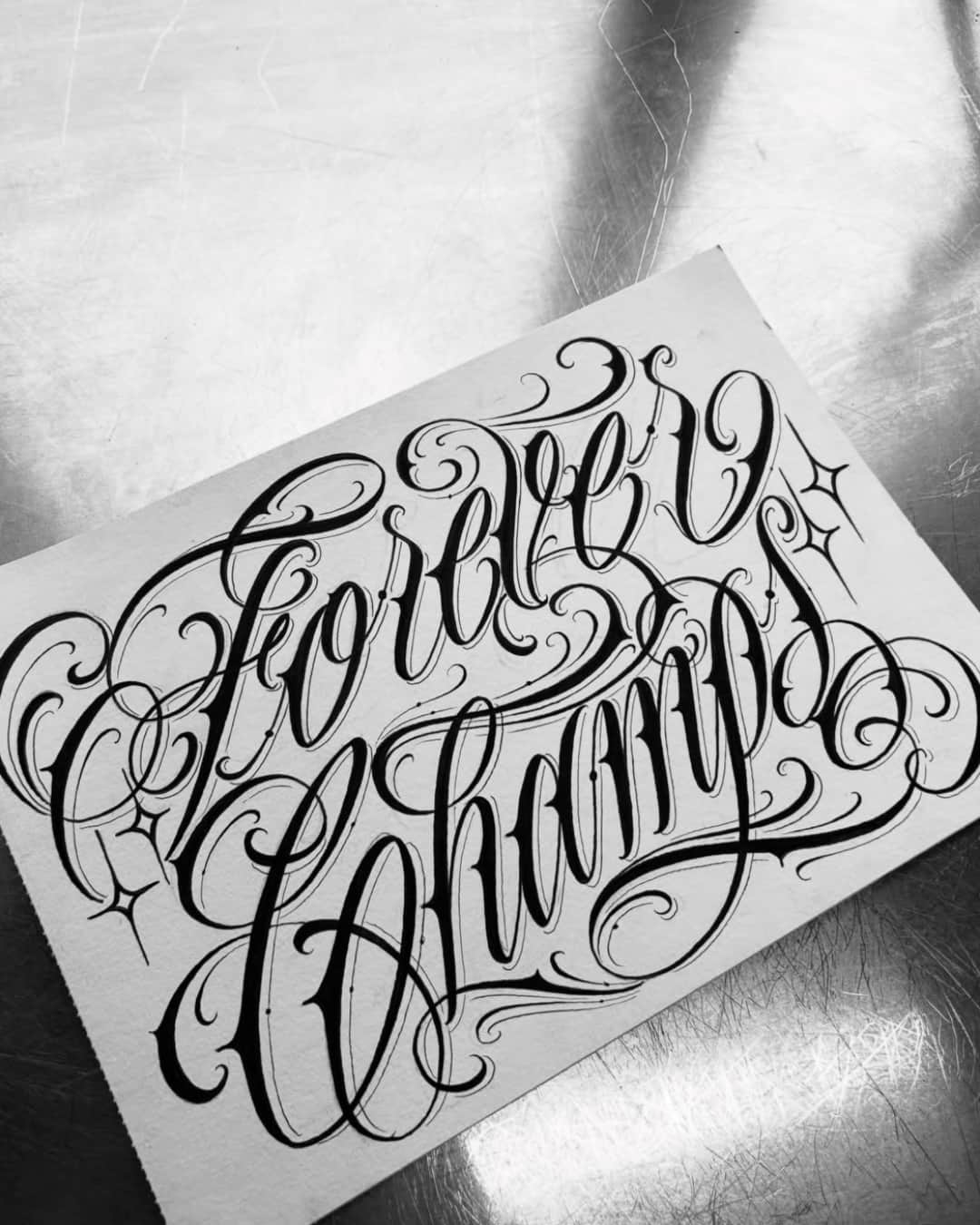
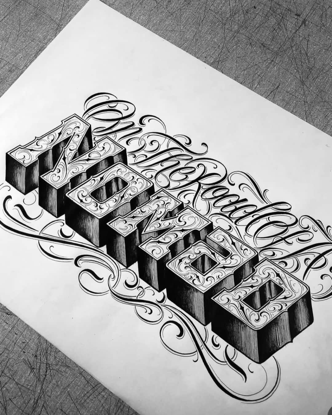
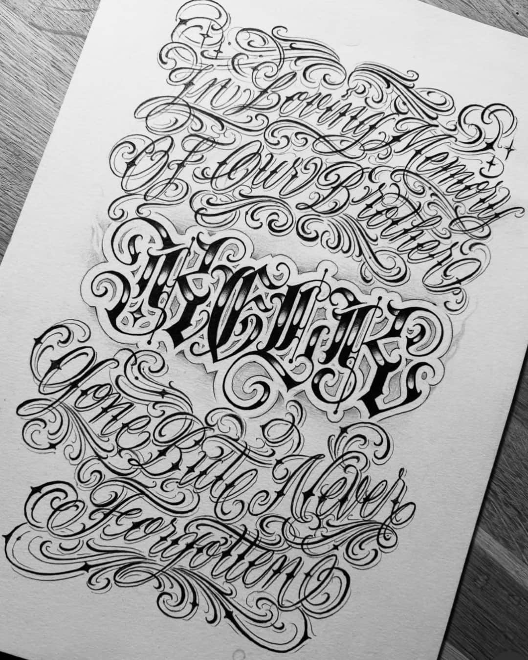
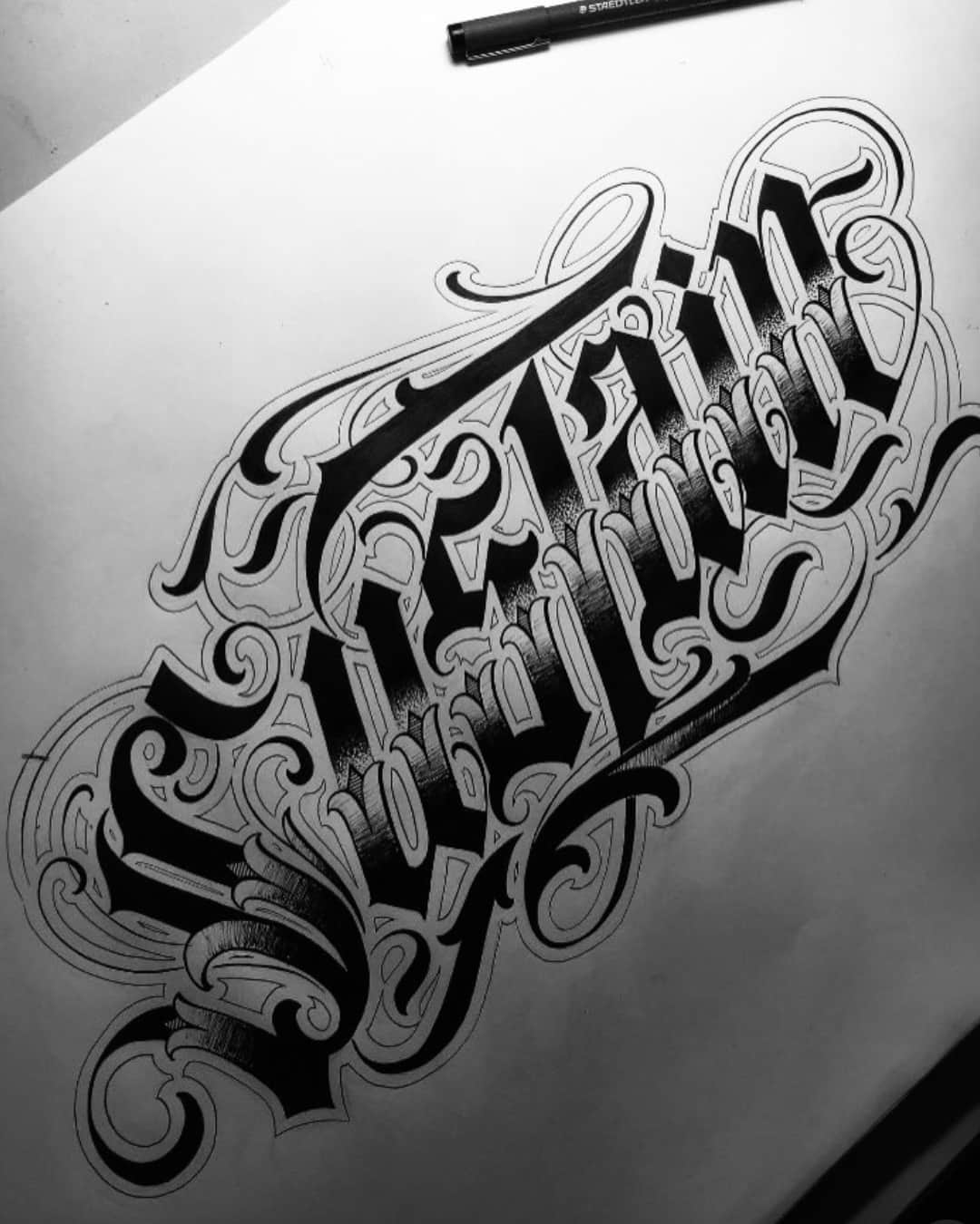
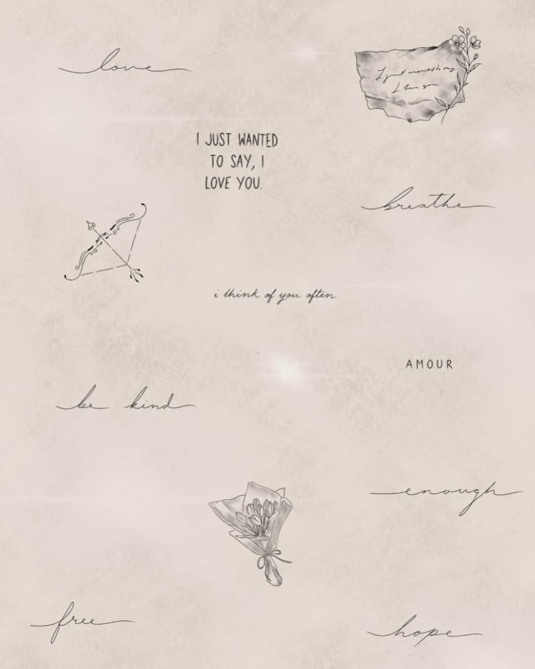
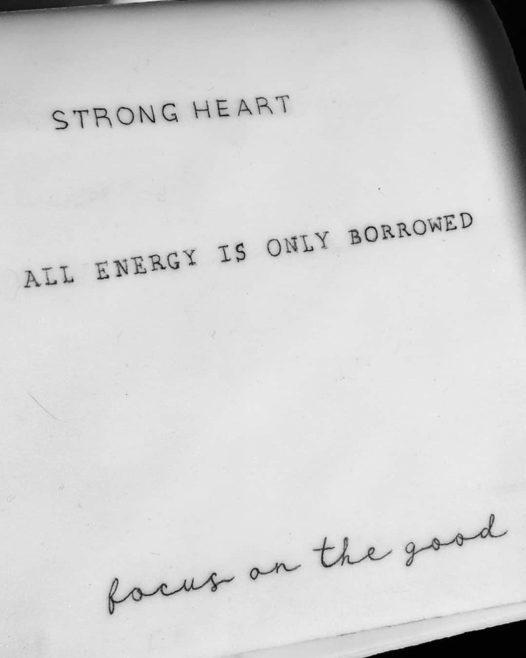
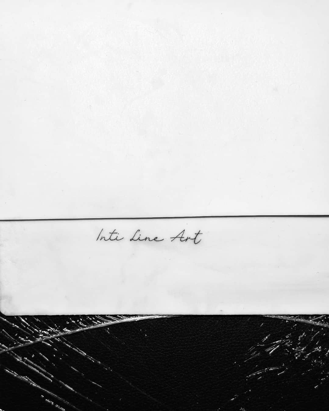
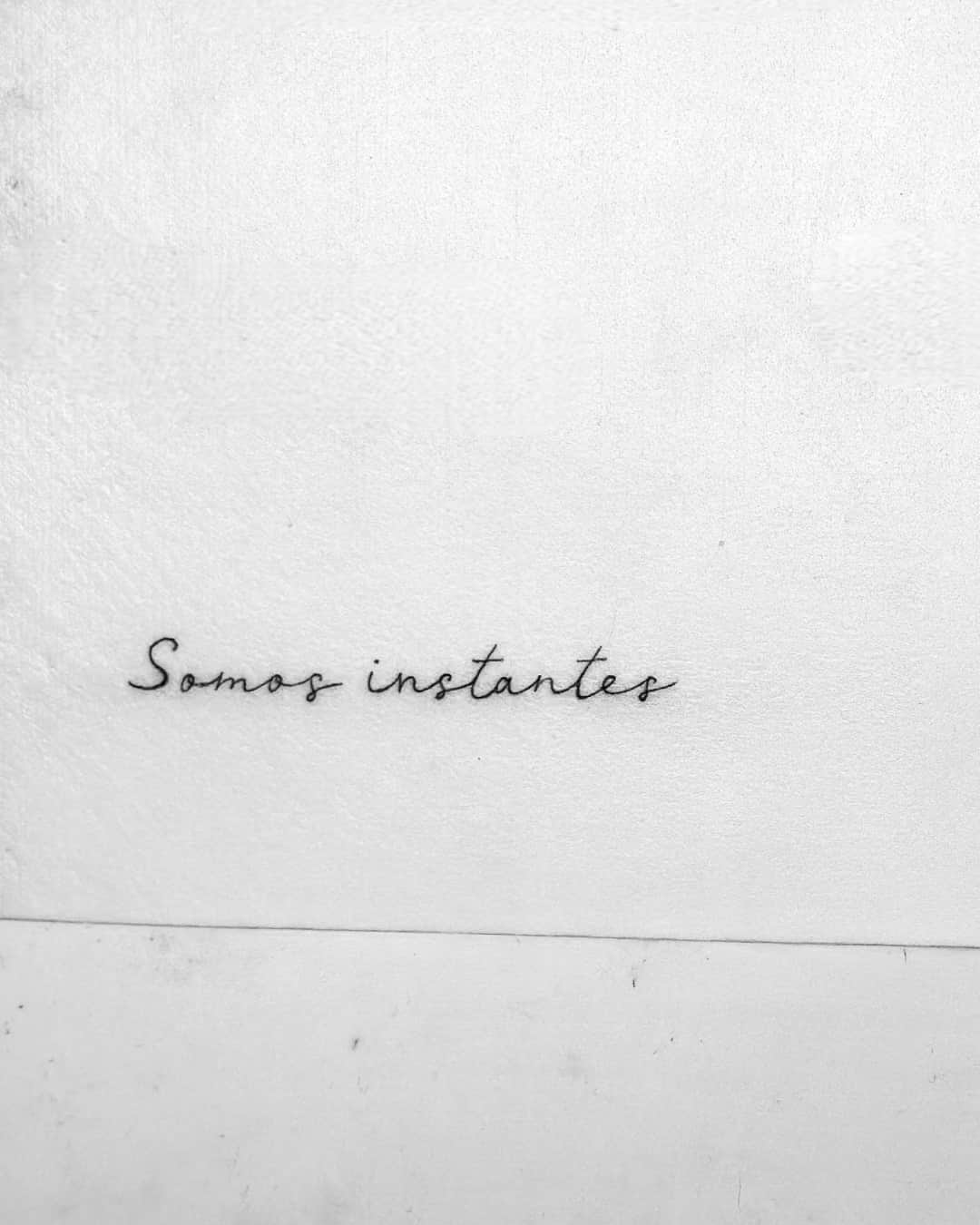
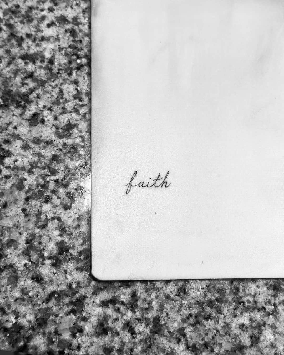
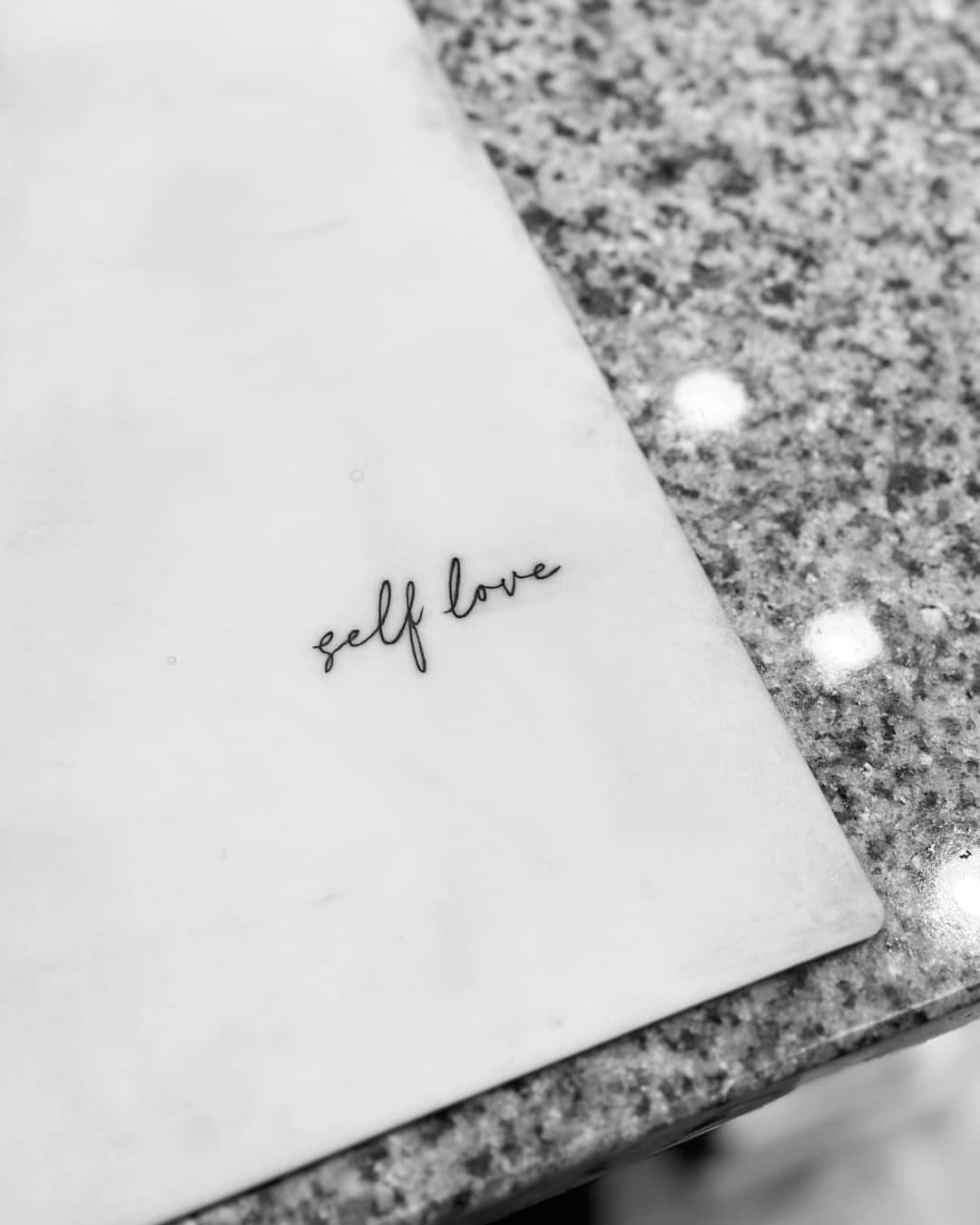
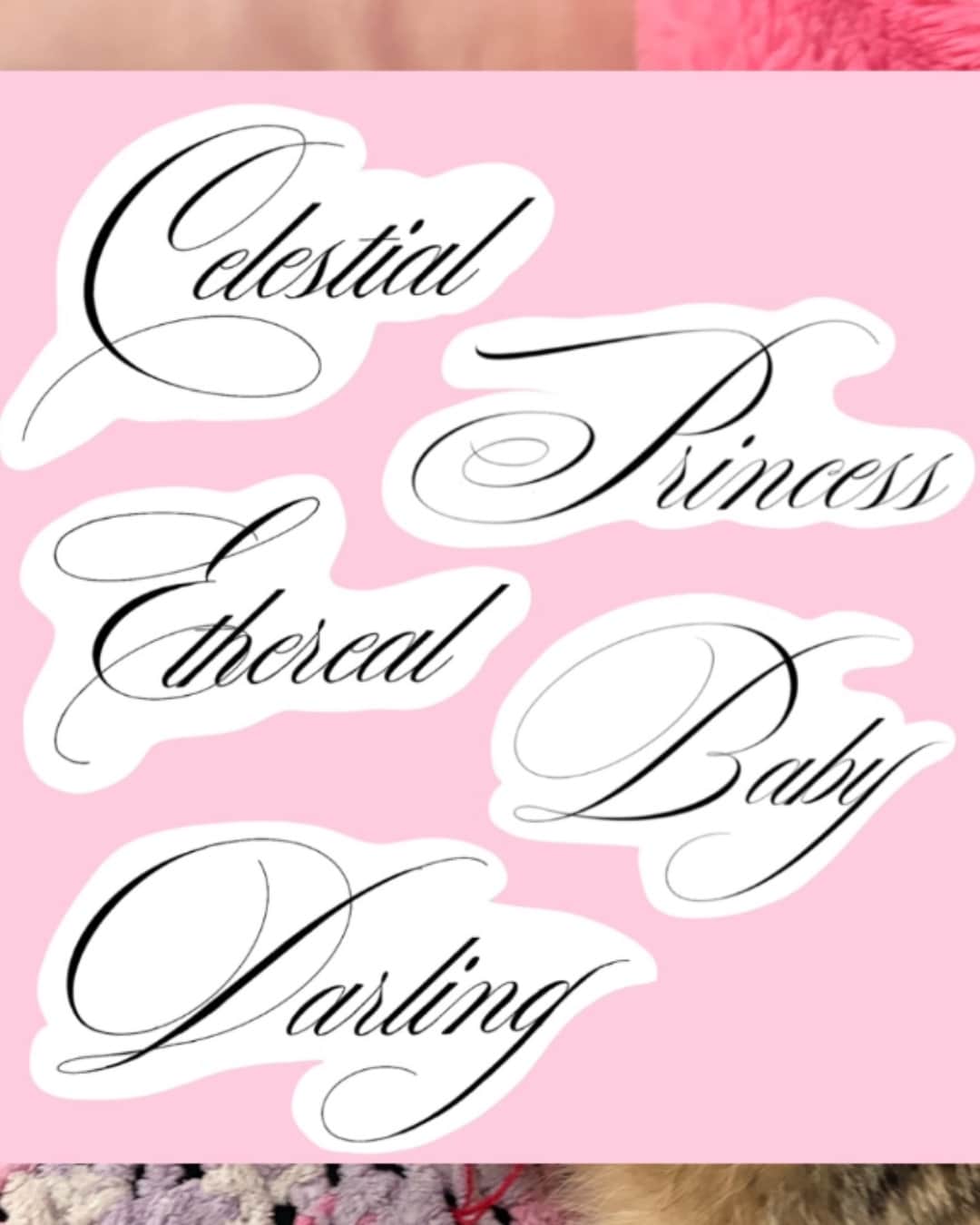
Lettering means first names, dates and quotes: gothic, script or block, usually drawn by hand rather than typed.
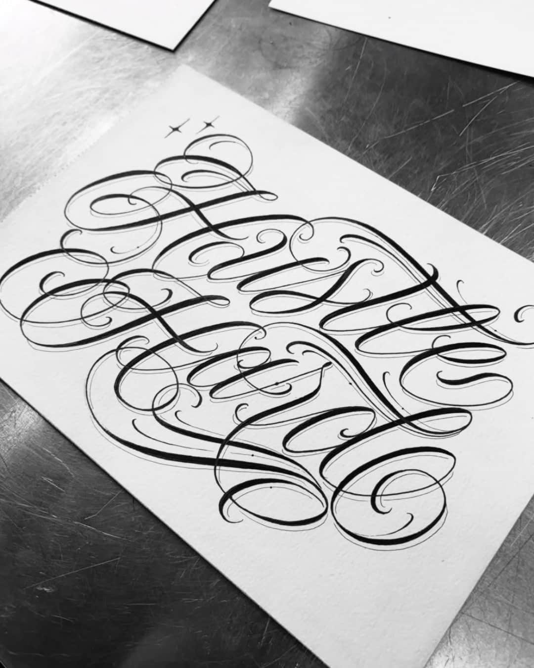
On YokoFolio, pick the style Lettering and then your city, and widen the radius if the list is short. Lettering is judged like typography: look at how even the baseline is, the spacing between letters, the balance of thicks and thins, and whether the counters — the openings inside the letters — stay properly open. Look for healed work: that's where you see whether the text stayed readable or closed up.
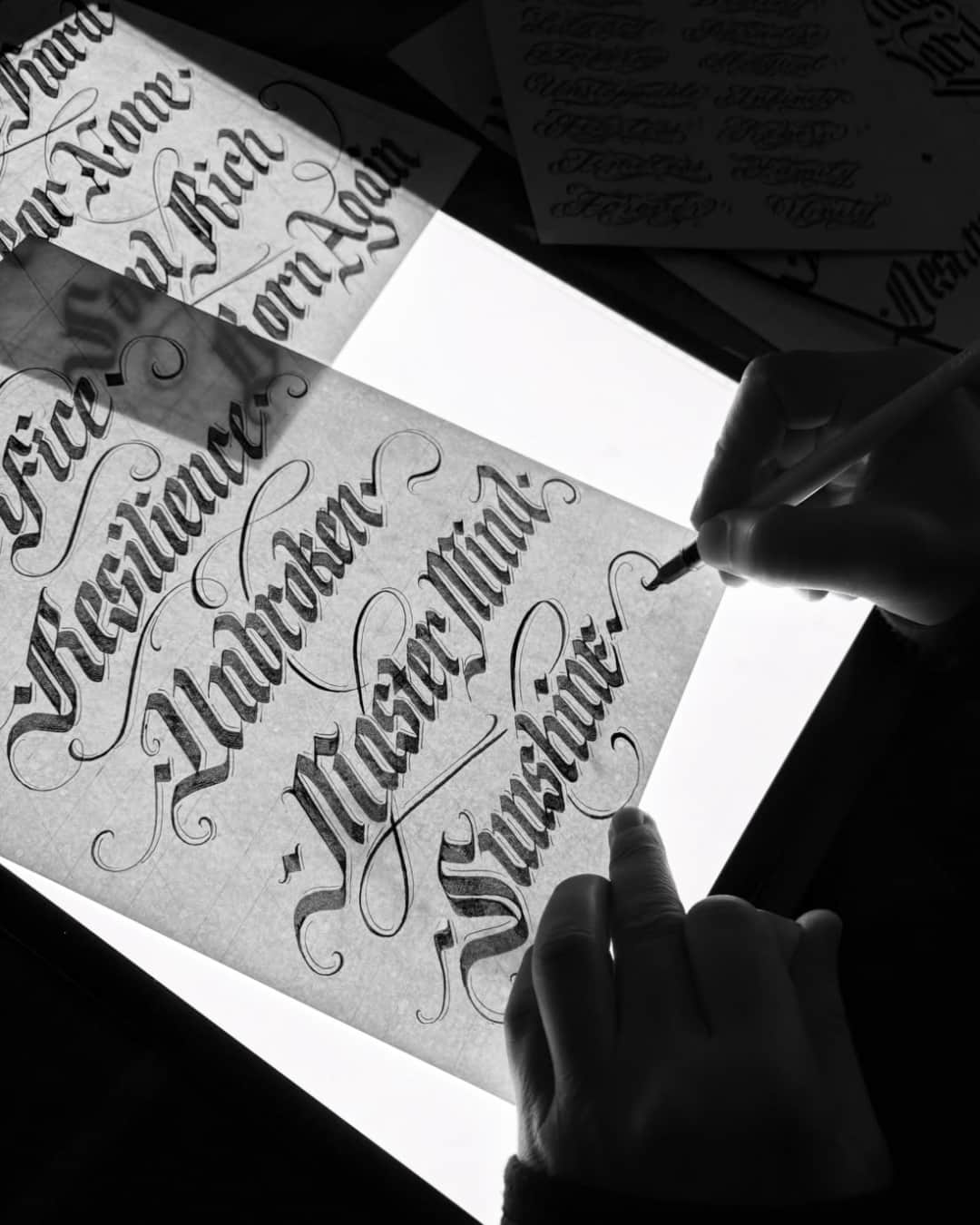
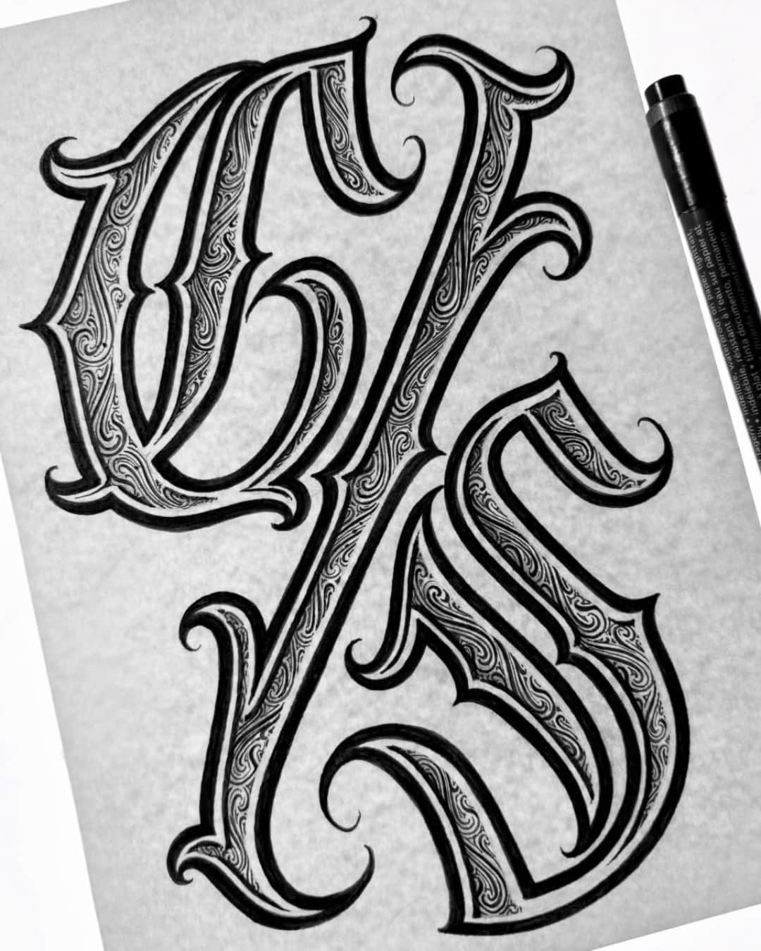
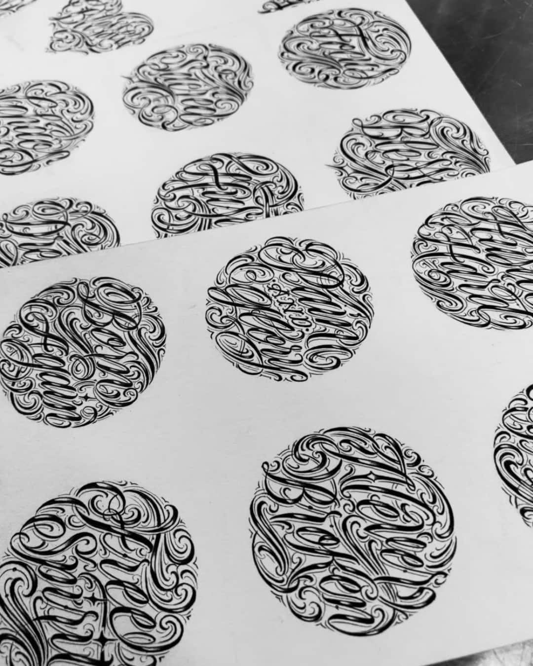
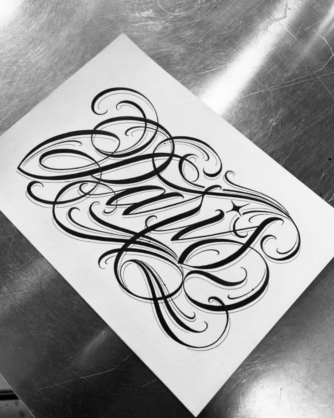
They're mostly hand-drawn scripts rather than installed fonts. Gothic and Old English, dense and ornate, come from medieval letterforms. Script, English or italic, gives flowing, slanted text. Chicano mixes slanted script and shaded capitals, inherited from neighborhood calligraphy. Block and poster lettering serve short, highly readable text. The choice depends as much on the length of the text as on taste.
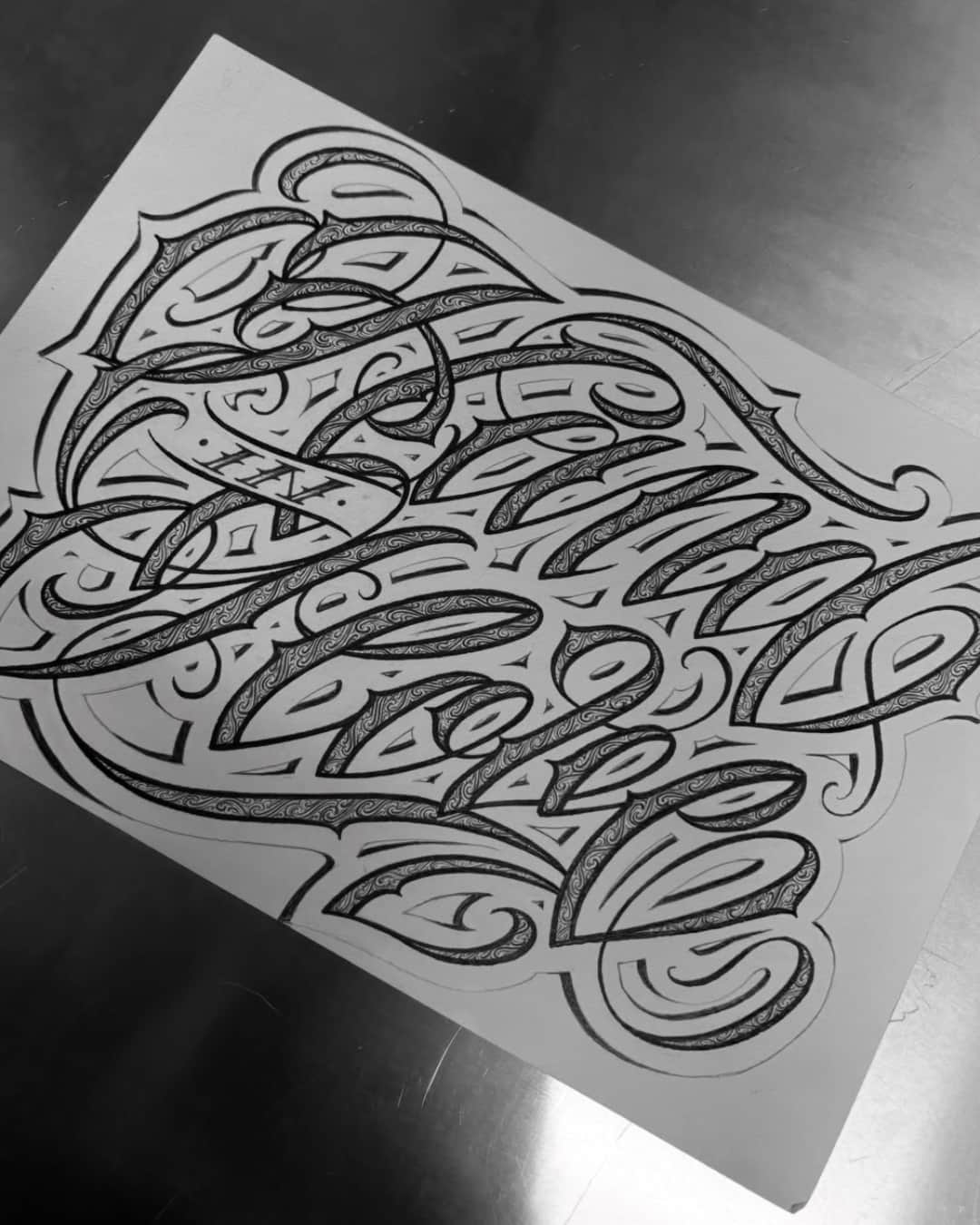
It's lettering where the letters aren't tattooed: the background gets inked, and the areas of skin left bare draw the text. The effect is strong and very graphic, often used inside a band or a blackwork fill. Two things to know: it needs generous size, because the reserved skin closes up over the years, and it's almost impossible to correct afterward. Ask to see healed work before you decide.
Like every line, it spreads — and on a letter that spread fills the counters: the inside of an e, the eye of an a, the gap between two stems. That's what makes text look blurry after ten years. The fix is well known and comes down to three things: generous size, wider spacing than seems necessary, and an area that doesn't rub. Sized properly, lettering stays readable for a very long time.